My Small Living Room Makeover for West Elm
This is my 120 sq.ft. living room makeover I worked on for West Elm. Check out their blog for more tips! It's a shotgun style home. They're very popular in New Orleans and dates back to the early 1800s. They're basically a long and narrow, rectangular house. Ours had the living room in the front, then kitchen, followed by the dining room, bedroom, and with a bathroom in the back. The idea is that if you firea shotgun at the house, it would go through each room. It's a little scary sounding.
I focused on the living room because it's the only room with good lighting. The dining room is pitch black so I refuse to put my desk in there. I wanted the living room to be a multiFUNctional room. It's where we work, watch The Americans, hadvegame nights, nap, eat, and where guests sleep. It's a really fun room. Let's see some befores...
BEFORE
The dogs haven't warmed up to me yet. Sterling did not give a damn and Luigi looks like a scared pup. Now they can't get enough of me photographing them. There used to be a huge bush growing in front of that window in the corner which is why the landlord nailed it shut. The bush was later removed but they never reopened the shutters and it never seem to bother my heartmate either. I took care of that problem the day I moved in. I was like, "You see this? This is a window. It's suppose to let in light." Mmhmm. You're welcome.
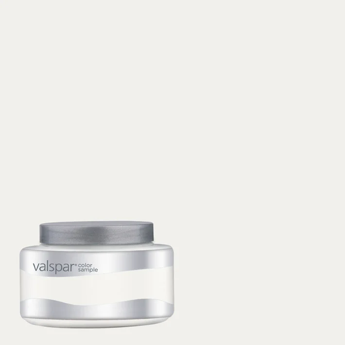
This was me working with what I had, so the before version of this before was a total disastuh. I didn't really mind the color of the wall that much. It was a nice putty, pukey, grey. It made the space feel smaller because you could see where the walls stopped. I had to paint it white to open it up. And it's okay to the paint the door another color because it's smaller and creates contrast in the room. The pop of orangey yellow door makes the room so fun! For the white, I used Valspar Swiss Coffee. It's a soft, creamy white. For the yellow, I used Valspar Orange Glow.
Here's the room with just new furniture in it. Is this what minimal looks like? Should I have stopped there? Or is this boring? Because both Luigi and Sterling just gave a big ol' yawn. Much happier pups now with plants, art, and pretty much life. Many people are afraid of filling up a small space with things but sometimes the more you add the cozier and bigger it feels.
Some of the artworks are by my heartmate and the upper right is by Everyday & Co. There is a hideous AC hiding behind that fiddle leaf fig tree. All ceramic plant pots are from Marshalls. They're so cheap.
This wall unit is the best solution for any small spaces.
People in New Orleans can definitely drink. We also get a lot of visitors so this Baron Deco bar cabinet is getting tons of love. I love that it hides all the glasswares, liquor bottles, and it has a wine compartment.
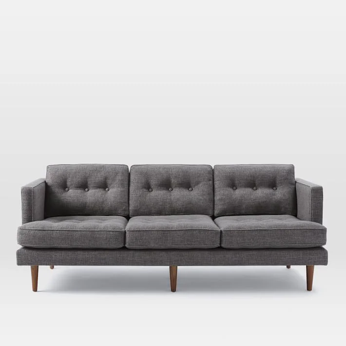
Luigi's resting bitch face. Serving up some real regal-ness. He's turned this Peggy sofa into his throne.
Sterling's still working on his fierce face but still cute as a button. He loves laying on the wool rug.
Best way to find art for your walls without spending much is to frame magazine covers, like this New York Times magazine of Massimo Vignelli. Or tear out your favorites. I used Acorn frames.
Sponsored by West Elm


