NEW WORK • COCOON HOME
A few months ago, Debra Szidon of Cocoon Home reached out to me to help with her rebrand. She needed a hot new logo and a new website. I've been following her blog for sometime so I was familiar with her work. She designs beautiful interiors and botanical arrangements. We definitely share a similar design sensibility — mixing traditional and modern designs and our penchant for brass elements. I knew this was gonna be a fun project to work on. She pretty much gave me full creative control and trusted me throughout the entire process.
Cocoon Home was more of a blog before and didn't really have a home to showcase her work. So we designed a beautiful and simple portfolio that highlighted Debra's work and services. The Cocoon clientele are typically late 30s and up so we wanted to do something modern and sophisticated. I knew from the very beginning that her logotype was gonna have brassy tones. The lines in the logo creates movement and beautiful shapes just like a cocoon without being too literal. We picked caldwell green to wrap it up. And the color blush will occasionally make a splash on some printed materials.
For the business cards, I initially wanted to do letterpress and gold foil but that ended up being too costly so I convinced Debra to do a simple gold foil stamping on 34 pt. cotton card stock with gold edges instead. Still pretty fancy, yes? Looks money and it didn't cost $5 a card. Whew.
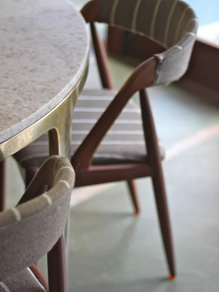
Photo by Debra Szidon
And this photo of her kitchen which she designed really inspired the whole thing. I'm super happy about how it all turned out. Hop on over to check out the new Cocoon Home!
Branding and web design by Dabito.

