The Windows Of Kips Bay Decorator Show House
Sponsored by The Shade Store
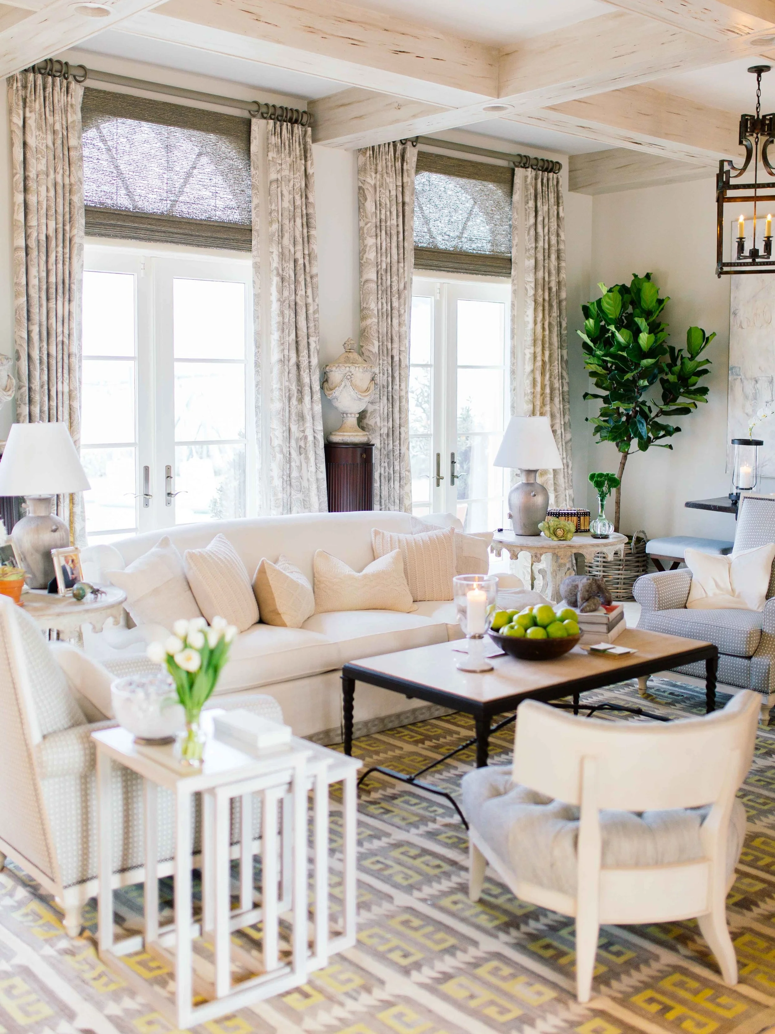
You’ve probably heard the expression “love is in the details,” and that couldn’t be more true for us design enthusiasts! I’ve never been much of a minimalist, but every single detail of my eclectic little home has been chosen with love. And even though I tend to change things up every so often, all the decorative elements I pick have a purpose — even if it’s just to make me happy when I see it! That said, when I recently got to attend the 2nd Annual Kips Bay Decorator Show House in West Palm Beach, which includes rooms decorated by some of the best of the best in the interior design world, I was in legit detail heaven! And a huge part of what made each room achieve its individual impact was the window treatment, courtesy of event partner The Shade Store.
Before nerding out on the nitty gritty design details of these stunning rooms and the role that window treatments played, let me share a bit about the history of the Kips Bay Decorator Show House. The event dates back to 1973, when it was started in Manhattan as a means of raising funds for Kips Bay Boys & Girls Club to offer New York City kids access to after school programs. Last year, the event traveled to West Palm Beach, and now, in addition to being pure eye candy for designers, decorators, and anyone who appreciates great design, art, and technology, proceeds benefits the Boys & Girls Clubs of Palm Beach County as well as Kips Bay Boys & Girls Club.
Needless to say I was thrilled to be able to travel to West Palm Beach to check out the 10,000 square foot “Fountain House” and every little labored-over detail inside! I’m always on the lookout for inspiration, and considering the fact that a wide variety of up-and-coming and established designers got to work their magic on the 20 different interior spaces, I was pretty much in heaven. One element that caught my eye over and over again was the way window treatments were used, either to heighten the drama, create a cozy feel, or otherwise totally lend to the room’s complete mood. And because The Shade Store is a family run company (which allows them to put lots of love into the details) that offers a full range of custom design services and uses luxury fabrics crafted by artisans in the USA, they were definitely the perfect brand to collaborate with these designers on such an epic project.
Design by Peter Dunham
Design by Lee W. Robinson
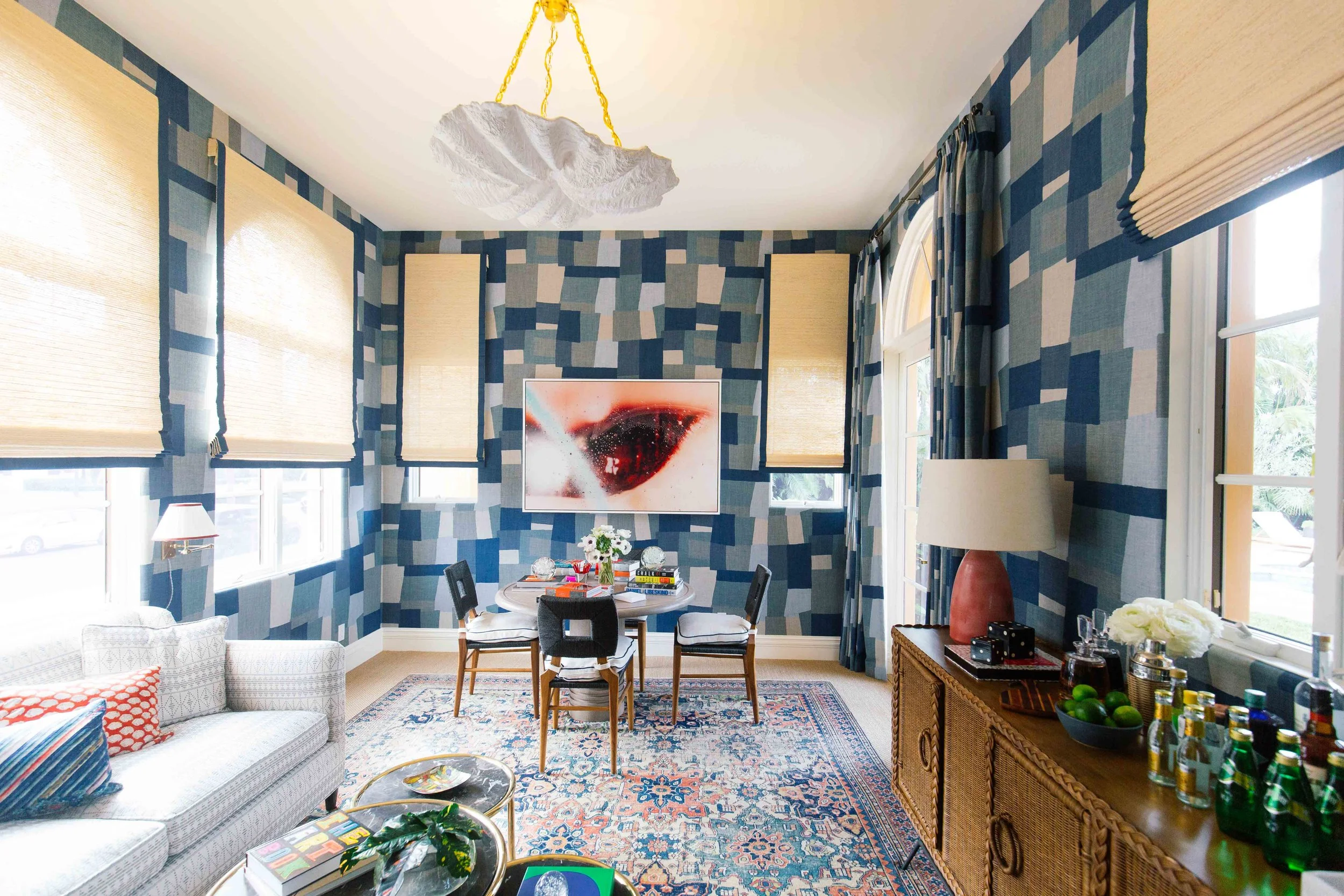
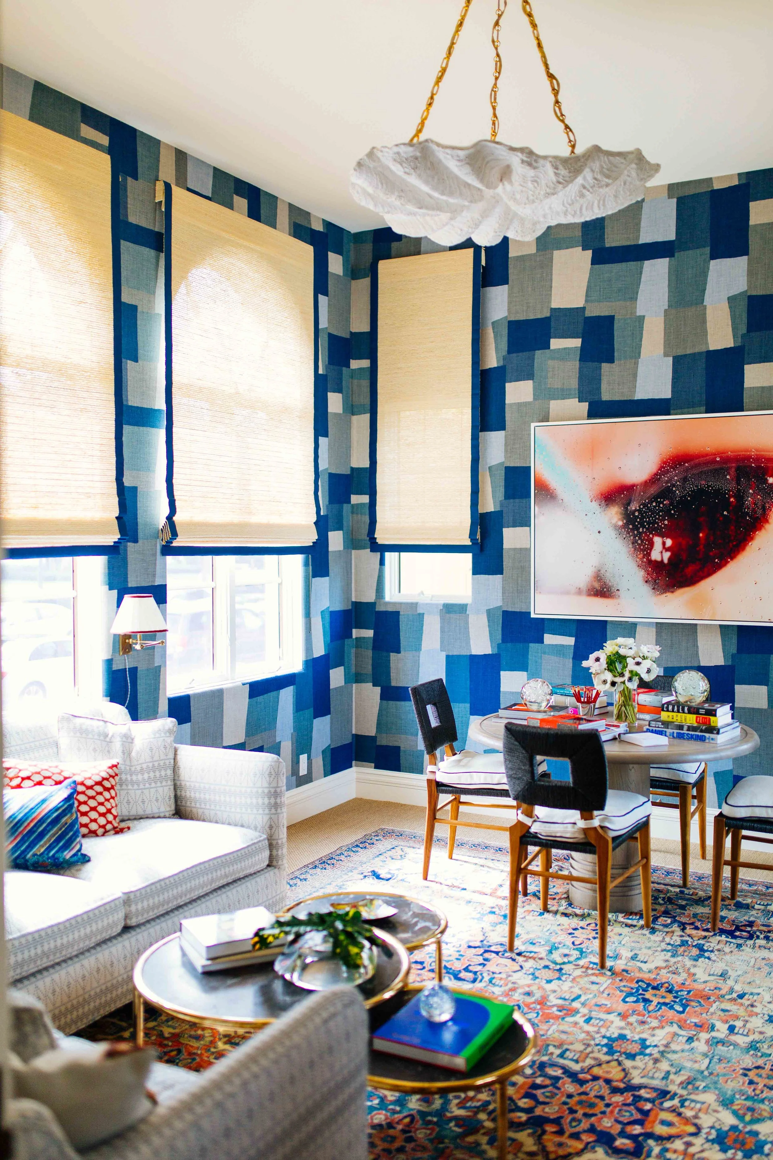
It’s crazy to think about how different some of these rooms would be without their respective window dressings — that’s really how much they complete the total look of the space. For example, the guest suite designed by Peter Dunham had blue patchwork walls that created a major statement, but the shades were clean, natural linen with wide blue piping. The juxtaposition allows you to focus on those show-stopping walls!
Love the Moroccan-inspired vibes in this living room designed by Cindy Rinfret.
Design by David Scott
Design by Lee Ann Thornton
This dining room by David Scott is gorgeous. It has a relaxed formal quality to it. I love how he used pinch pleat drapery to soften up the room along with all the art he brought into this space.
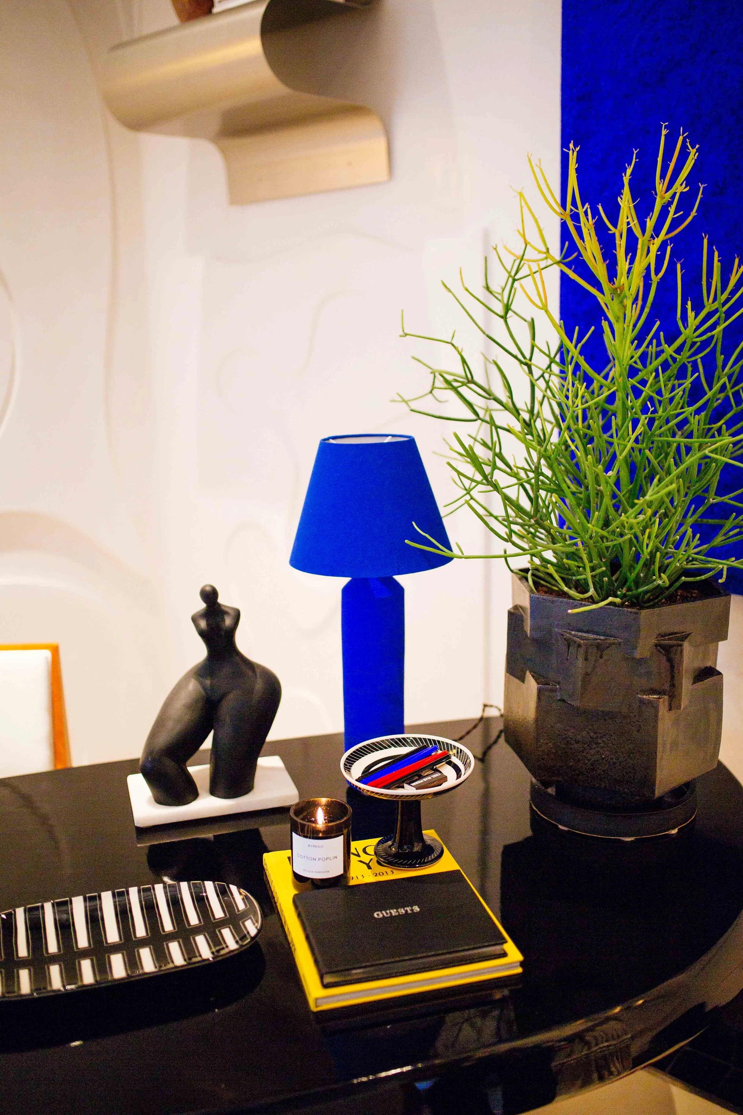
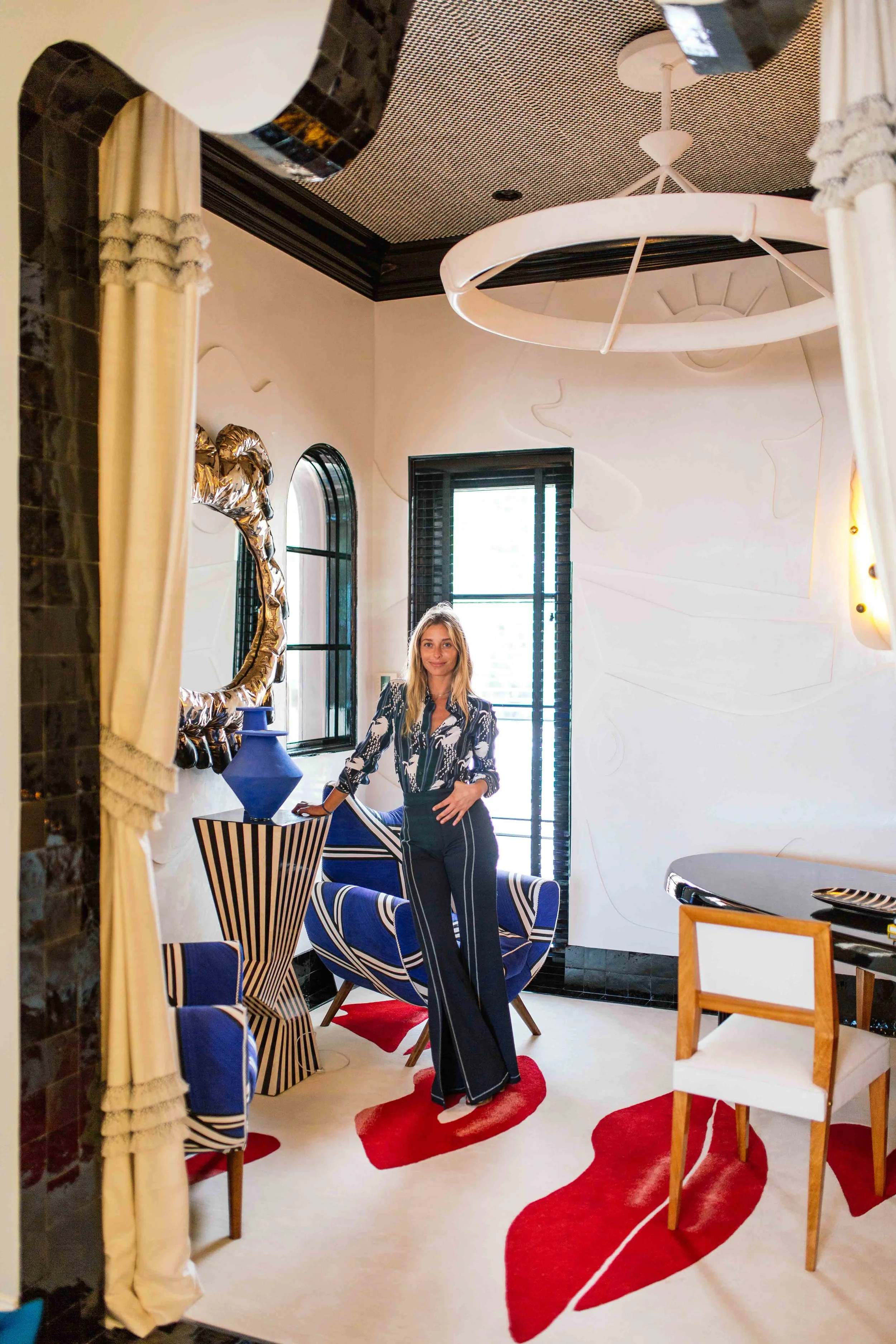
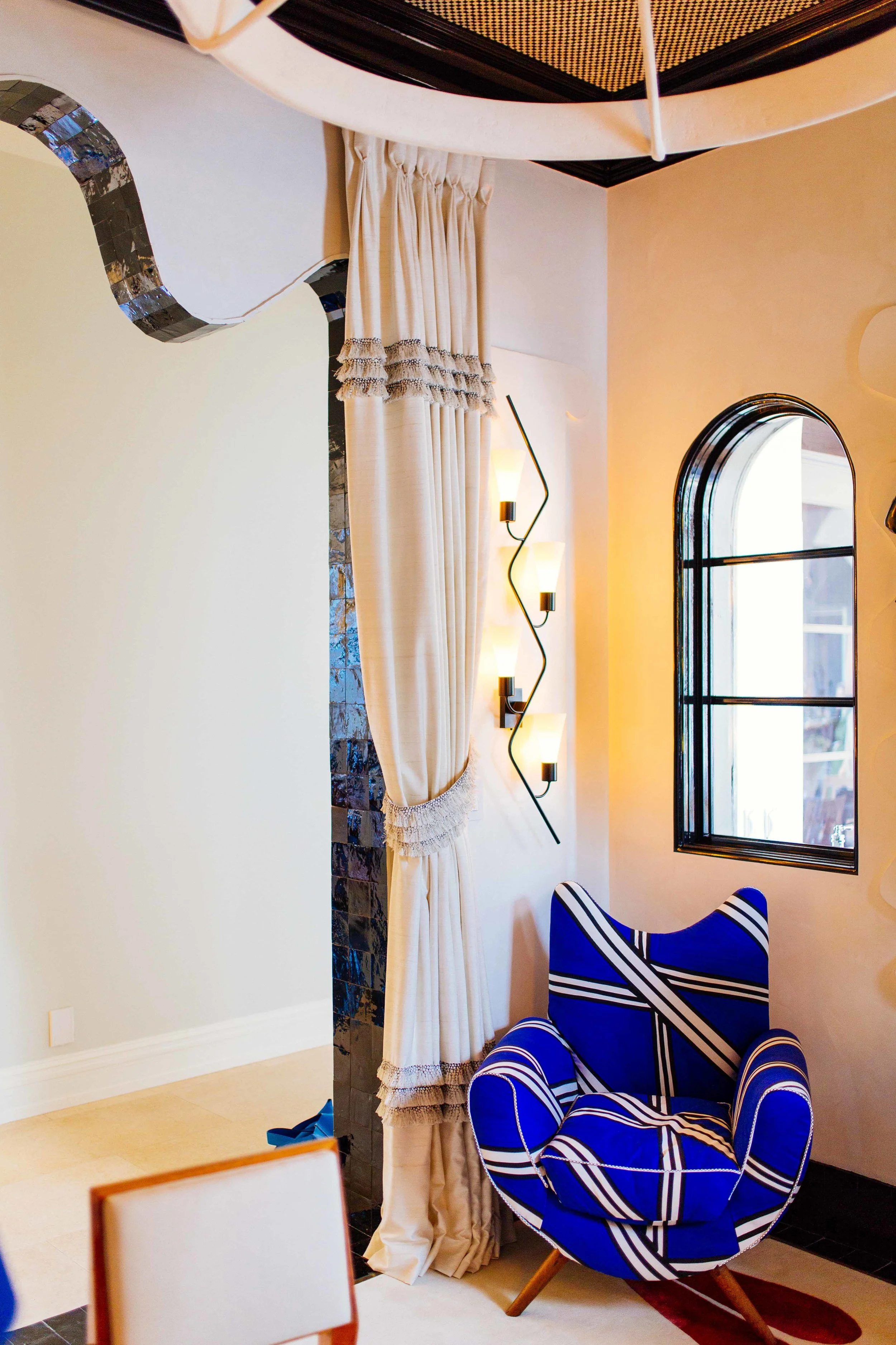
In the breakfast room designed by Jessica Schuster, the ruffled drapes and cobalt stood out in a surrealistic, Pop Art-inspired space that included cobalt blue furniture and accents and a lip rug. It was totally unexpected, but fun and gave the room its own signature twist.
Design by David Phoenix
Design by Mark Williams
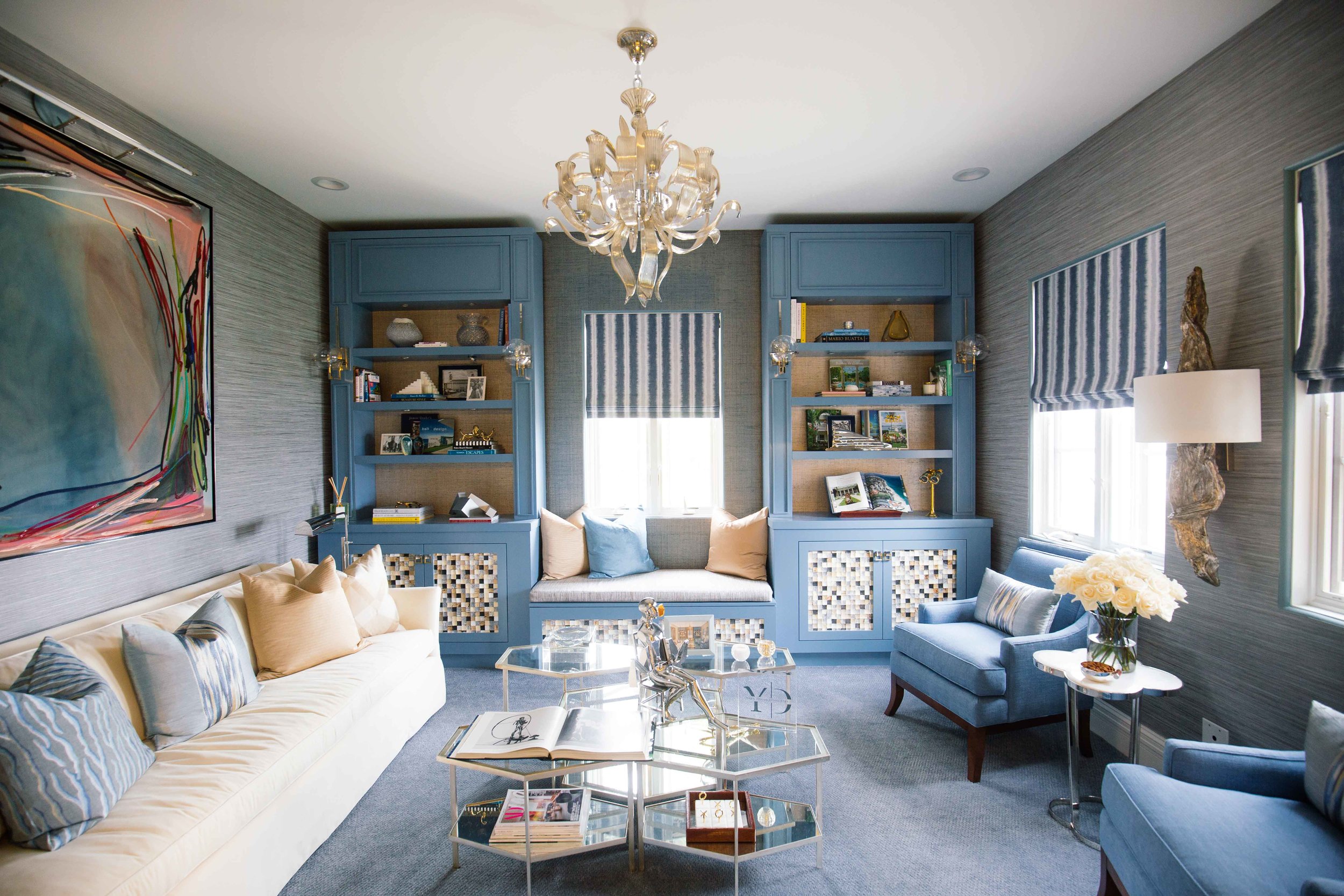
There’s a beautiful view of the ocean just outside of those windows which makes this room super calming. Designed by Leanne Yarn. These flat roman shades in Jeffrey Alan Marks' Intuitive Pacific are available at The Shade Store.
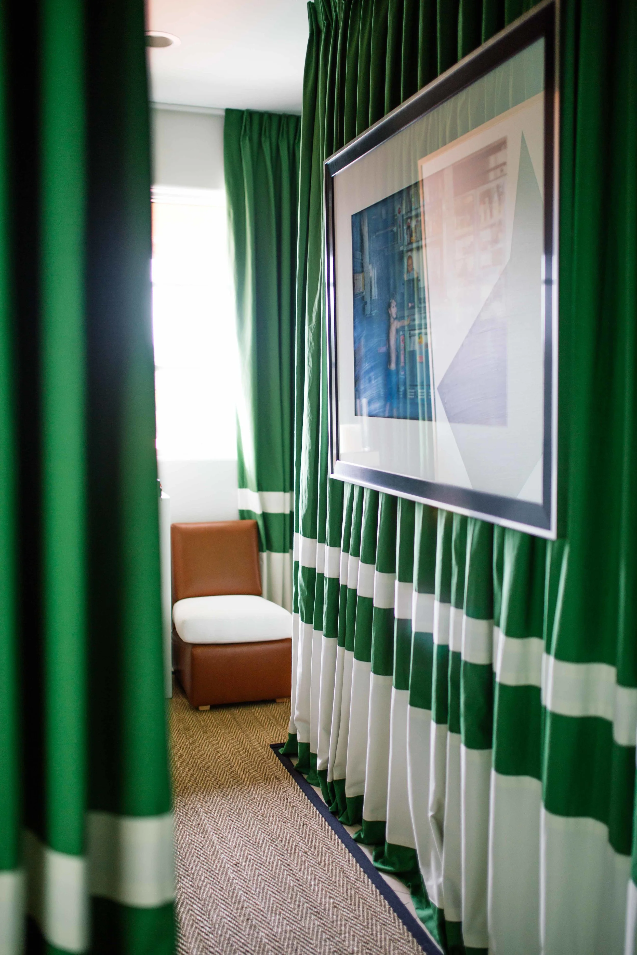
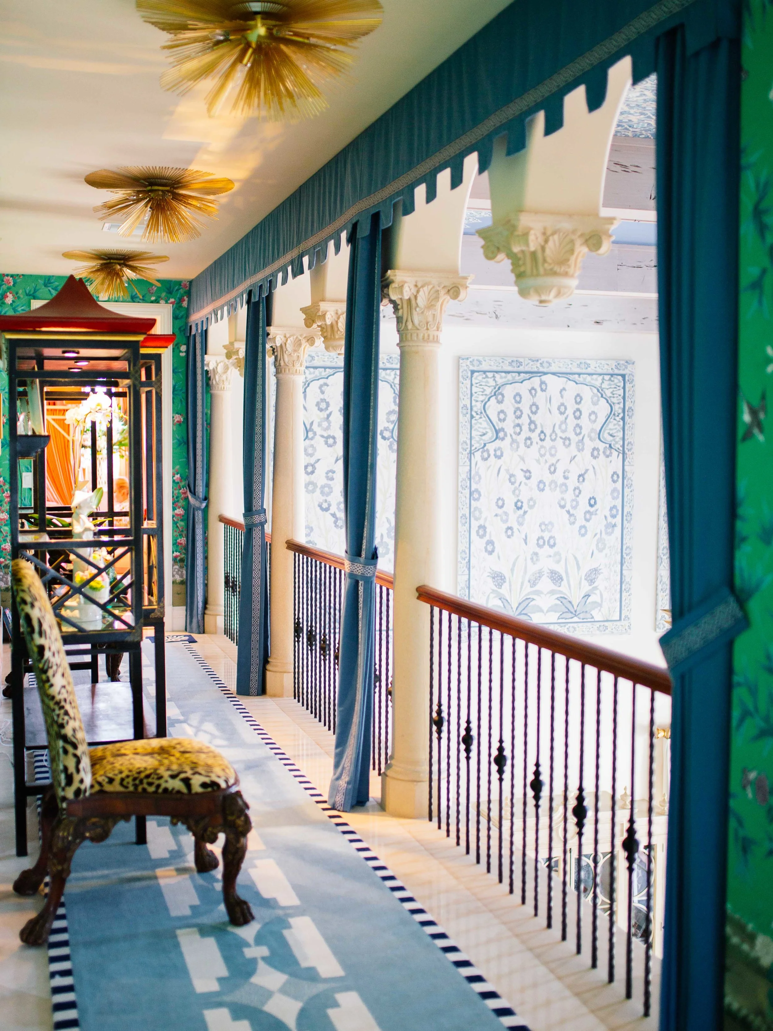
Or in the upstairs hallway, designed by Billy Ceglia, where kelly green drapery covered a major portion of wall space to give an intimate feel but also a major jolt of color. It was a great way to add some drama using drapery in such a tight space.
Design by Louise W. Cronan
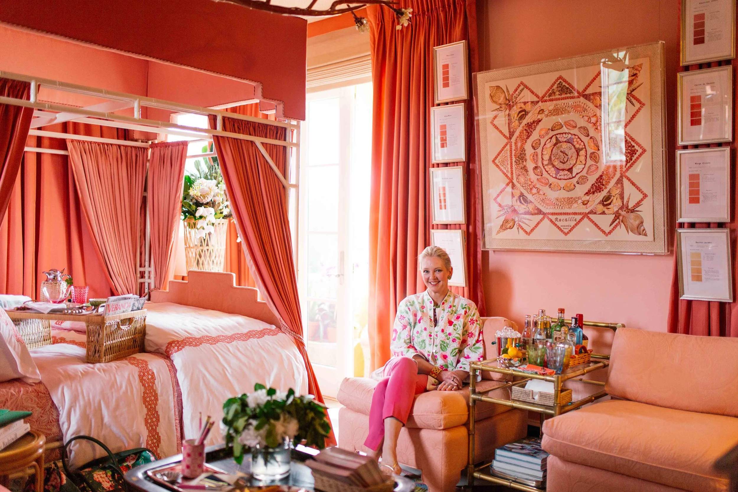
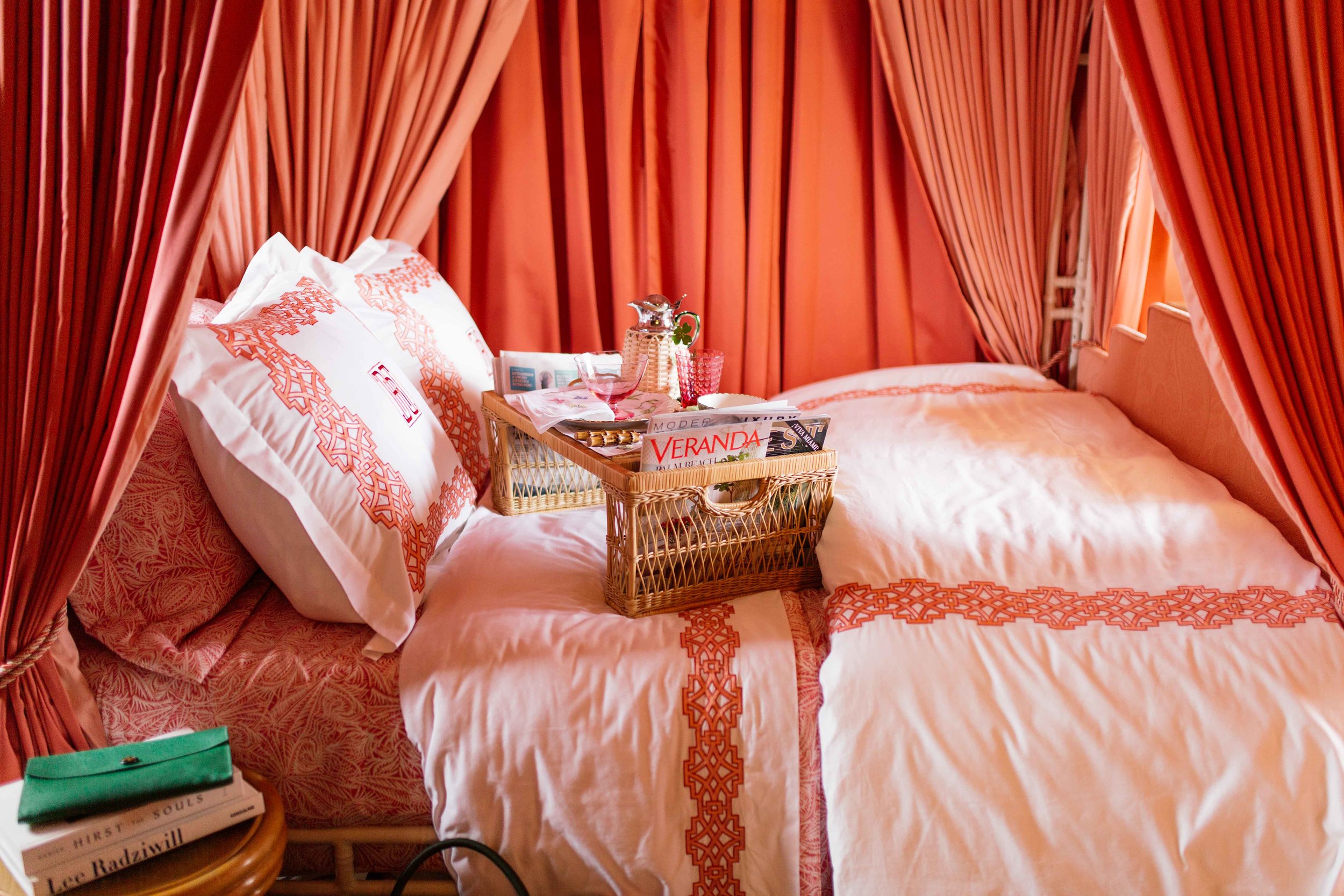
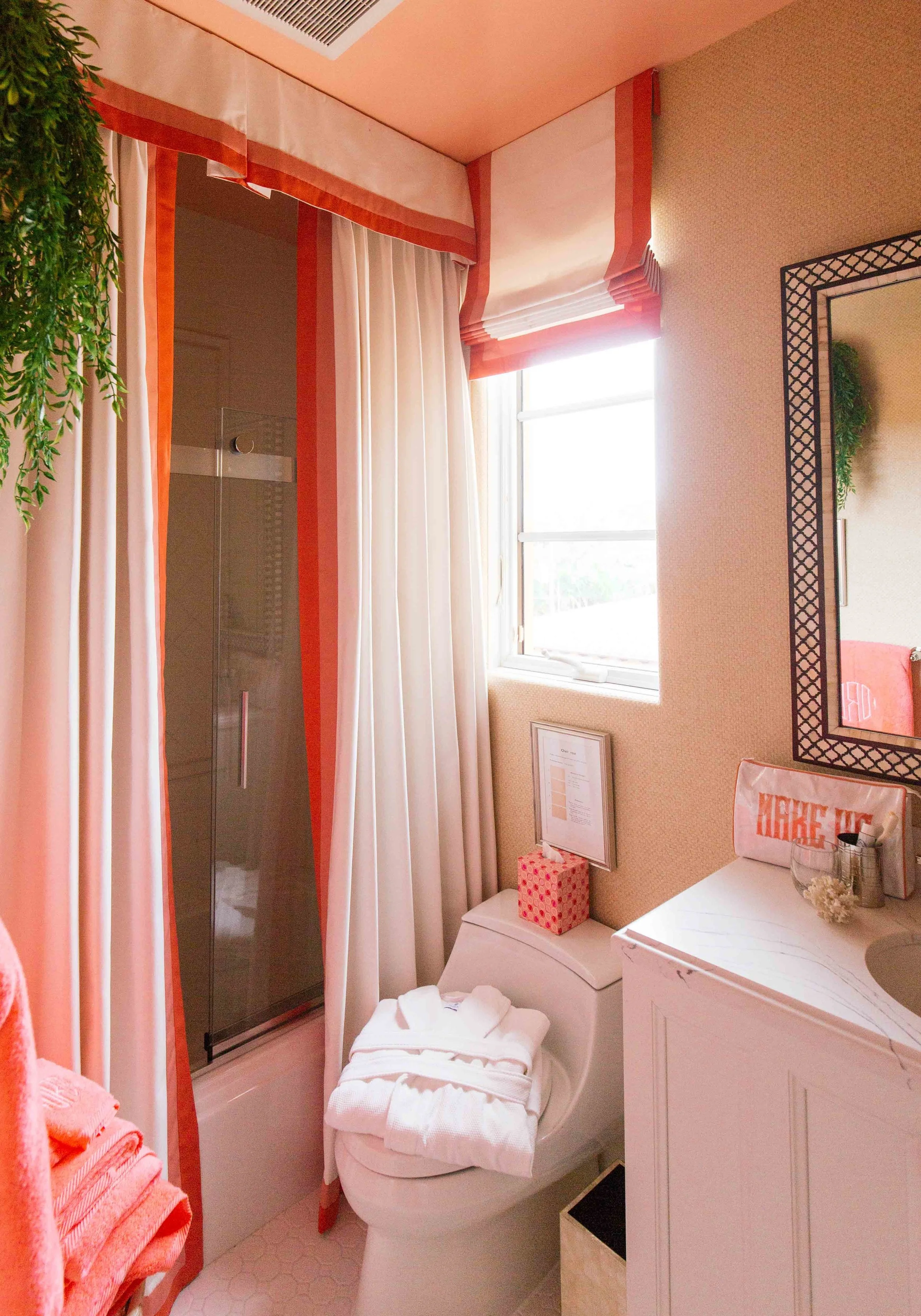
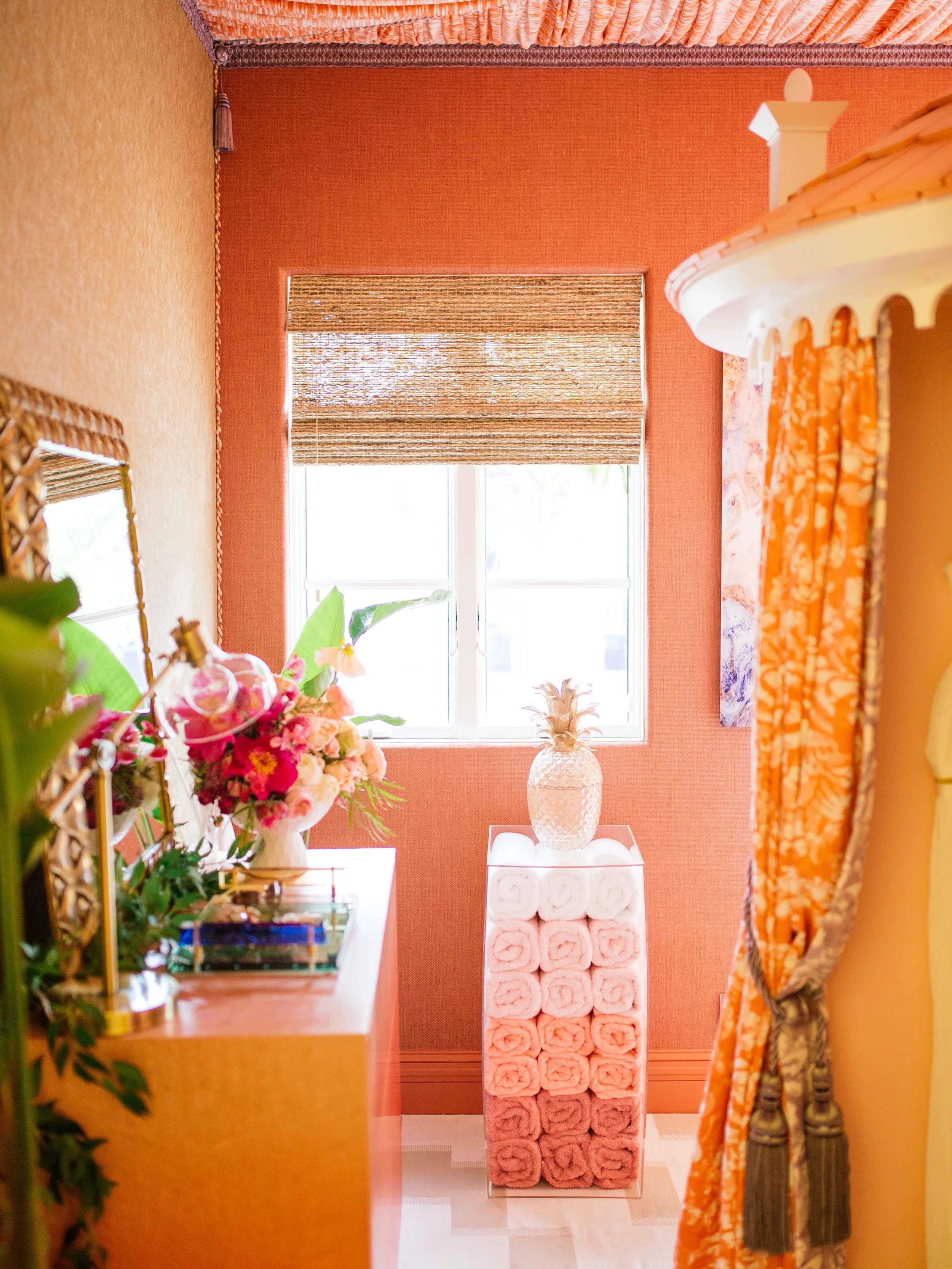
In other rooms, the window treatments were used to extend a color mood, like the blush pink bedroom by Danielle Rollins where the flamingo-colored drapes on the windows mirrored the fabric on the canopy around the bed to give the room an overall saturated romantic feel. And this bathroom also by Danielle is just lovely! This is how you do shower curtains, y’all! Instead of hanging just one long panel that’s often way too short, the floor to ceiling custom drapery adds so much height and character to this small bathroom.
Design by David Mitchell Brown
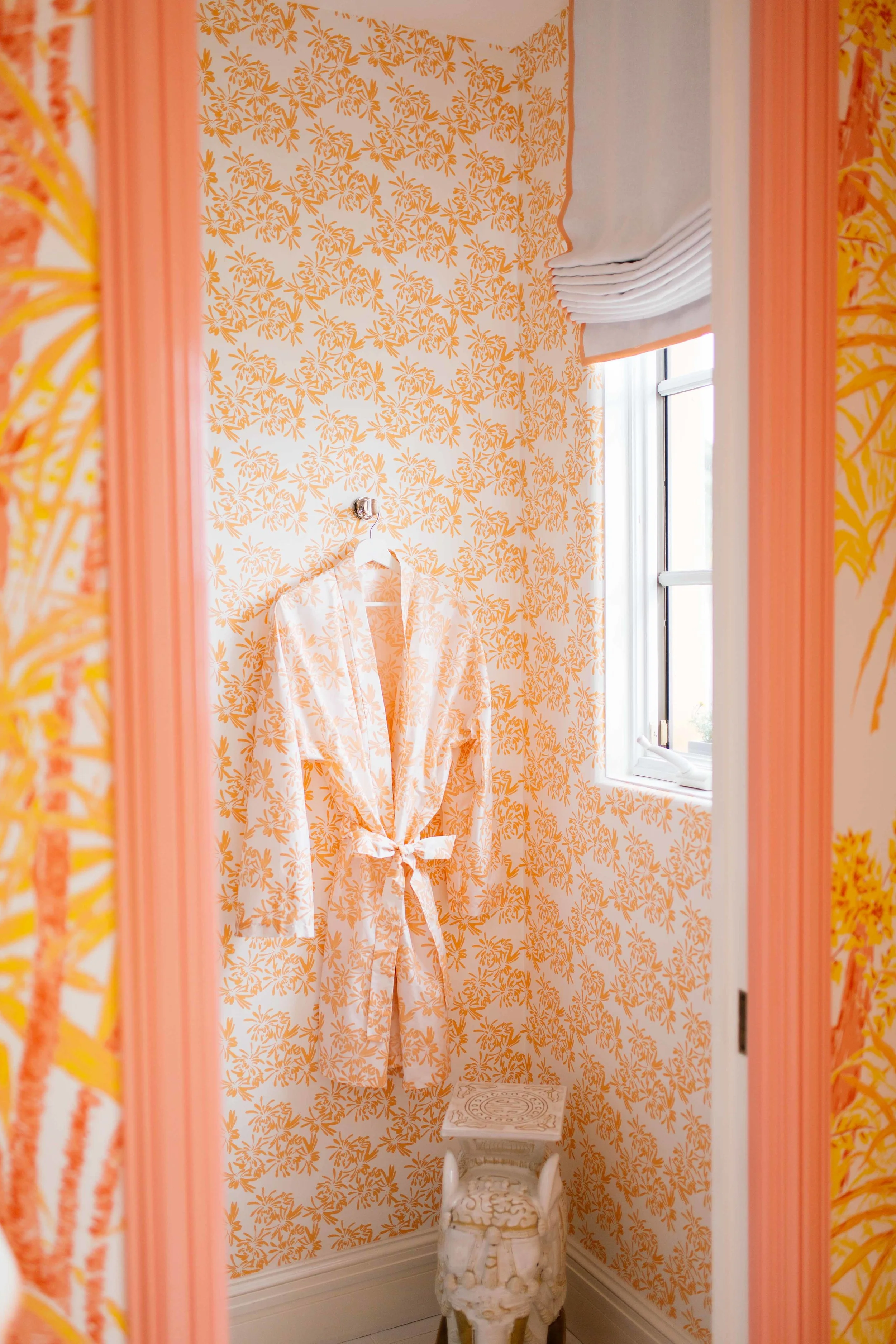
Similarly, in the case of the bedroom designed by Meg Braff, the drapes were kept white with just a touch of coordinating trim to match the vivid yellow and orange patterns on the wallpaper and textiles.
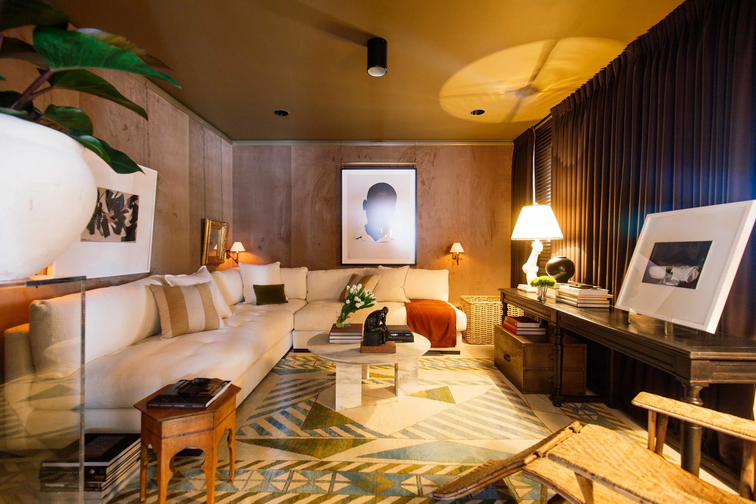
Another favorite room of mine is designed by Jason Arnold. It was a dark room to begin with and he really just embraced it and made it feel really cozy. He used tailored pleat drapery in wool flannel espresso with custom trim on a custom track system.
It’s so inspiring to see how all the designers apply window treatments in their spaces. They definitely all turned it out and didn’t hold back. I’ve never underestimated the value of window treatments and the impact they have on an overall aesthetic (or really any little detail for that matter!), but after seeing how The Shade Store was such an integral part of the Kips Bay Show House, it’s really making me imagine all the possibilities within my own home! In fact, maybe it’s time for a little refresh!

