Anna's Bathroom Transformation Part 2 Reveal
This is a sponsored post written by me on behalf of Floor & Decor . All opinions are 100% mine.
We are finally done with my best friend, Anna’s bathroom! It turned out exactly how she wanted and she’s super happy! She was like, “I can’t believe I have a Dabito bathroom!” LOL. This was a really fun partnership with Floor & Decor. They came through with all these stylish pieces for the transformation. From the mosaic tiles, double vanity, gold faucets, to the fixtures from their Studio Design Collection. It definitely made this reno super easy to shop for. They have so many fantastic options for bathroom updates. It took us five weeks to complete with a lot of help from my dad.
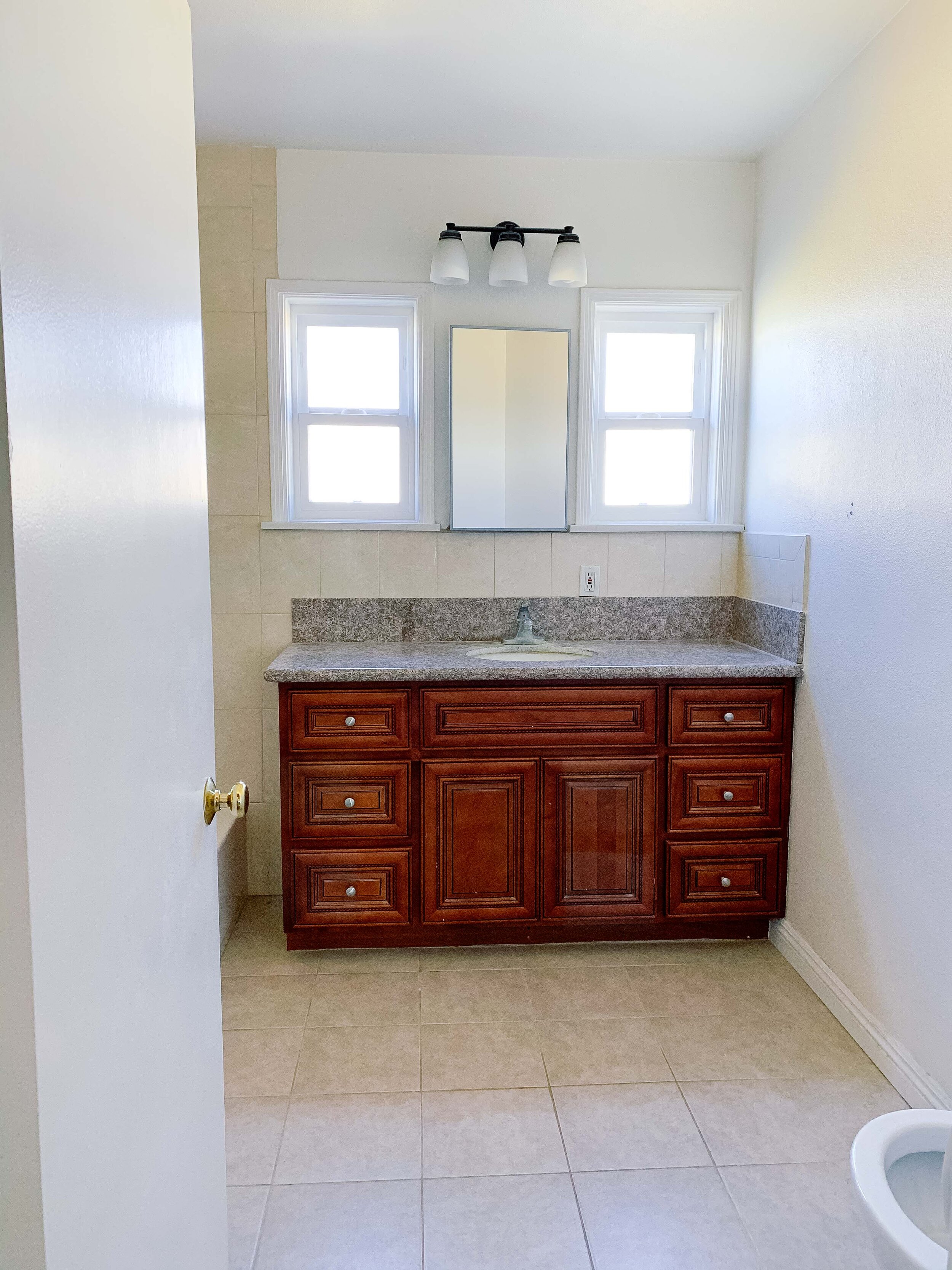
Before
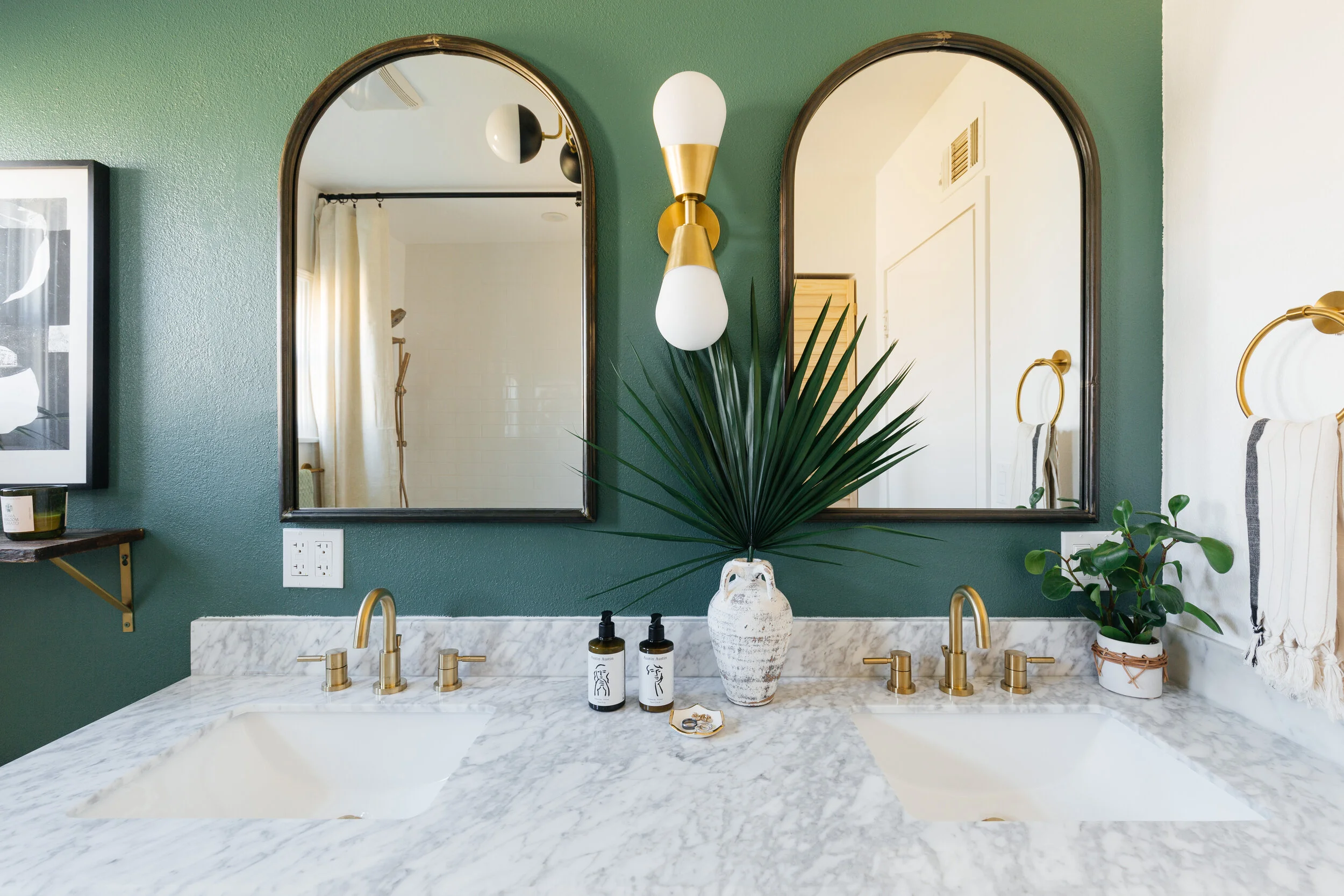
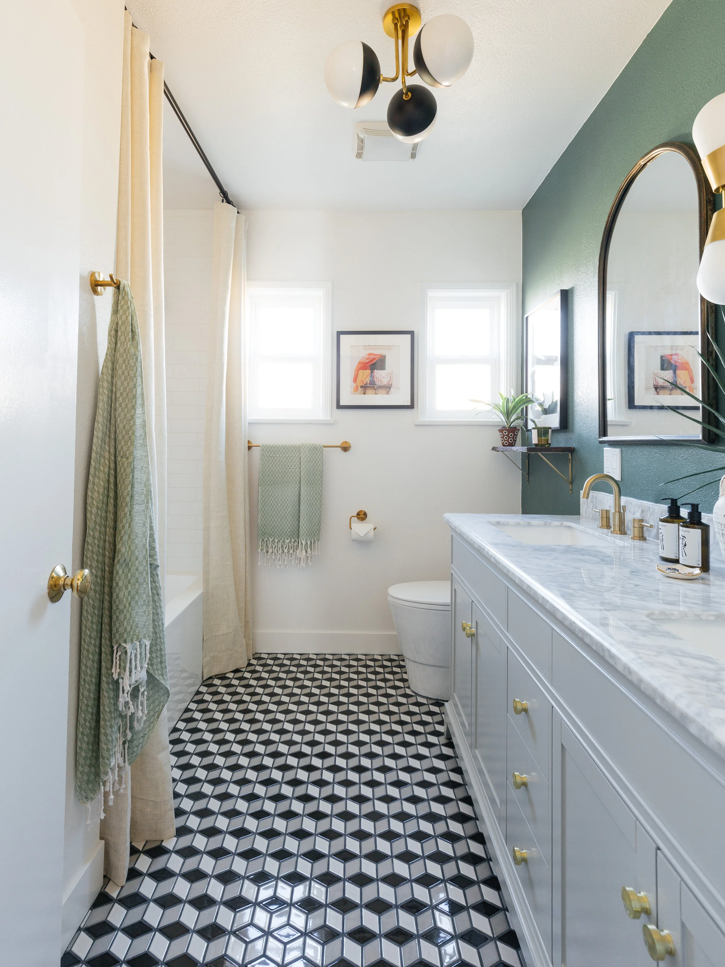
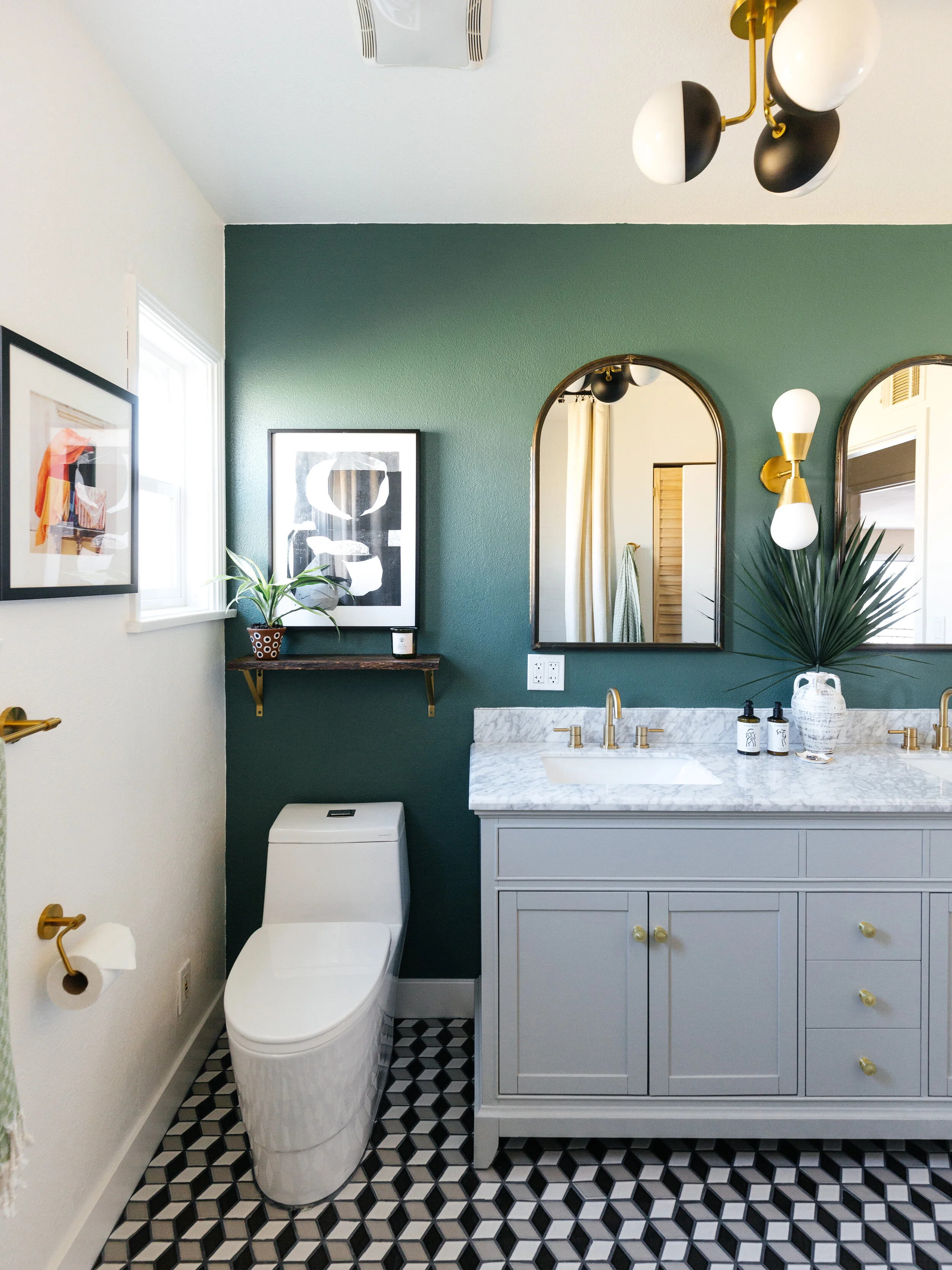
After
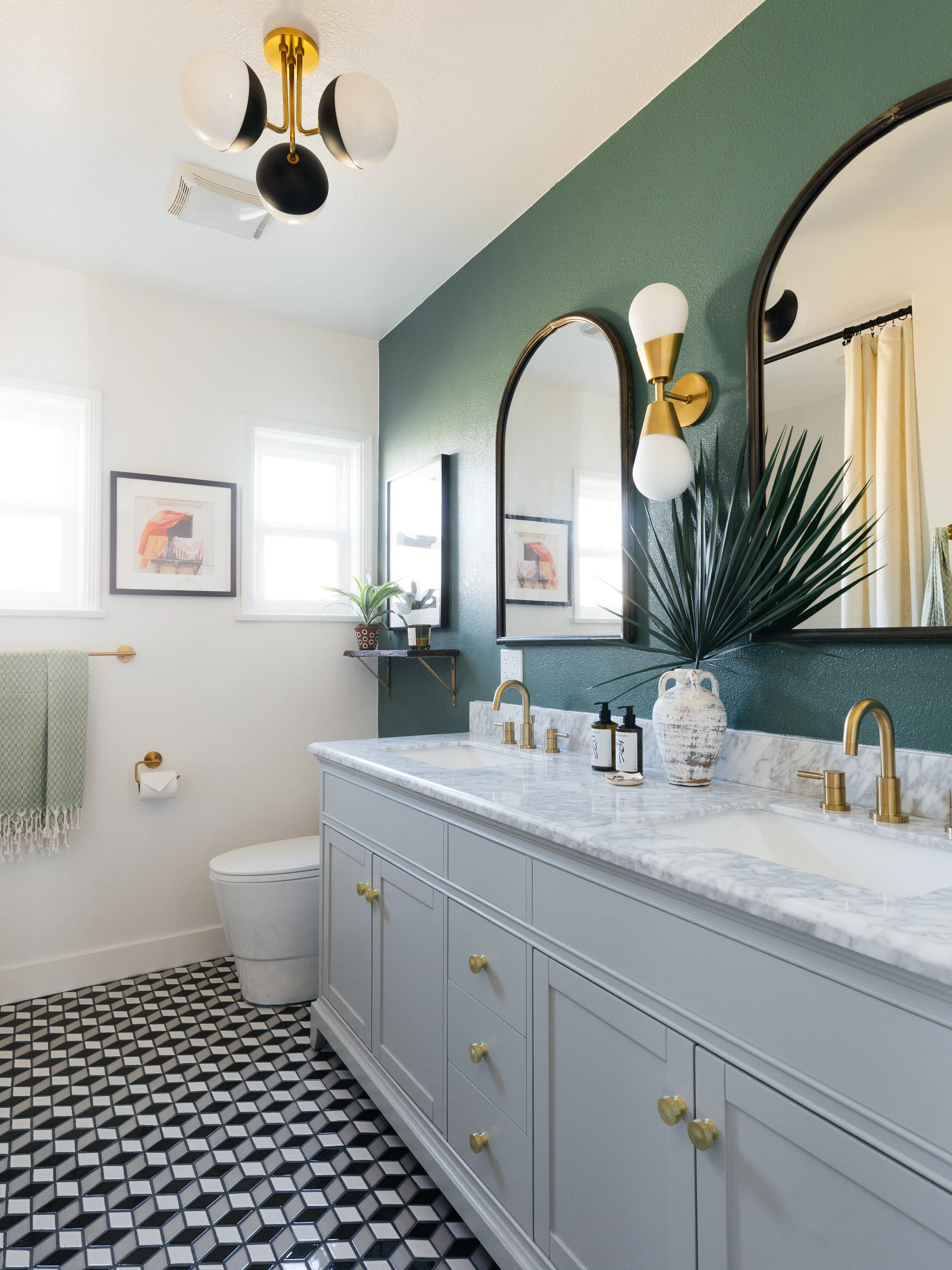
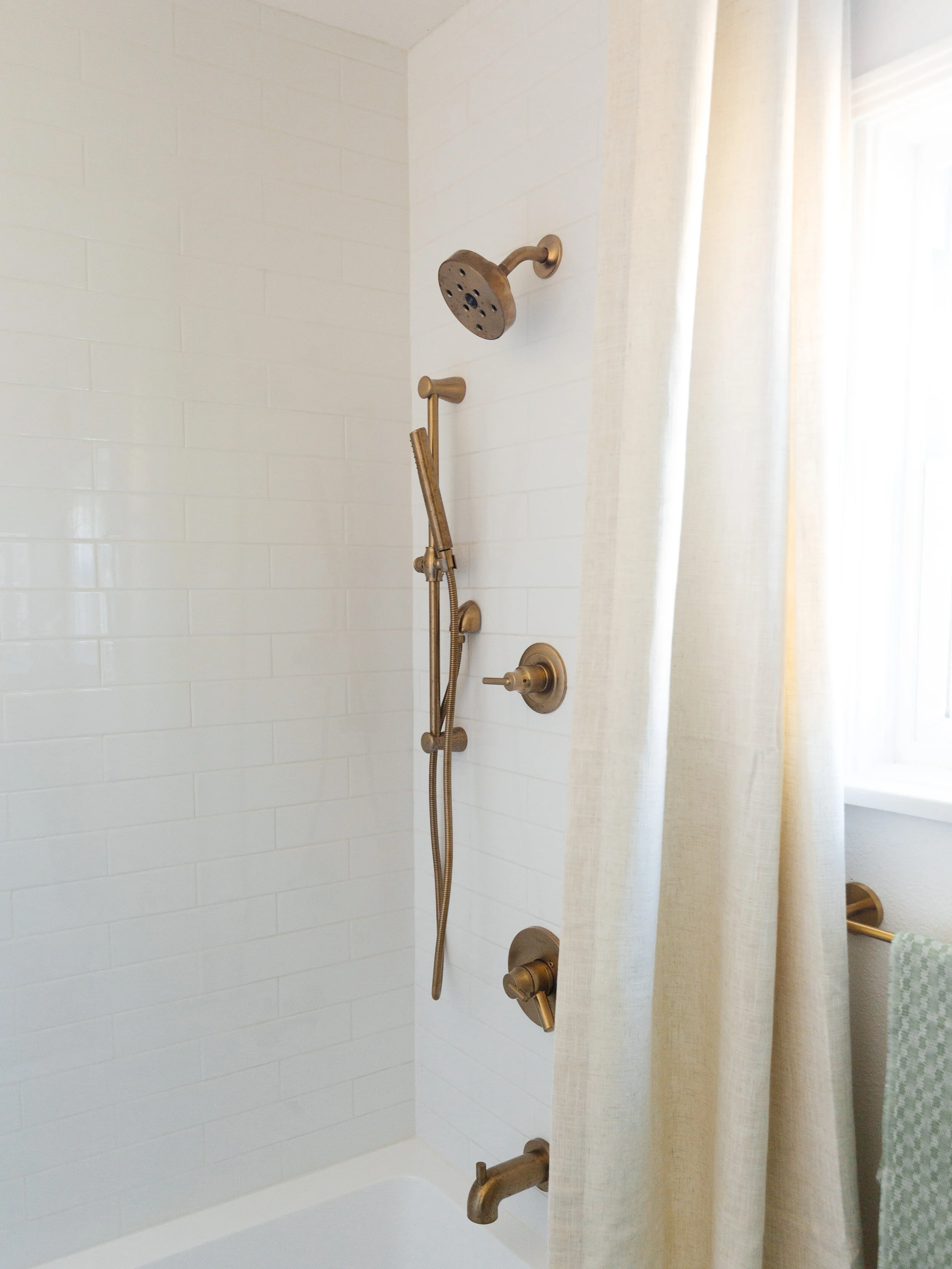
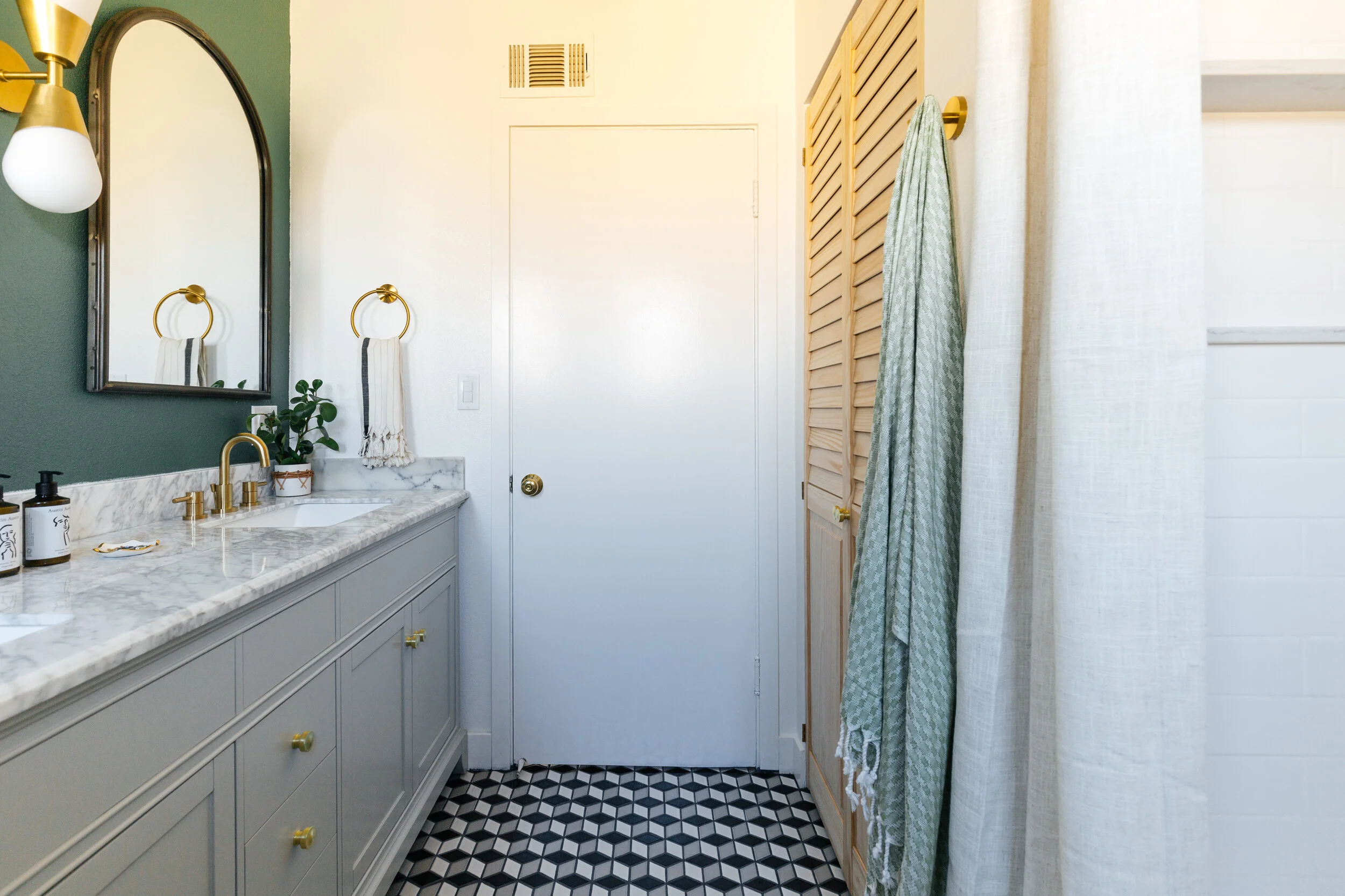
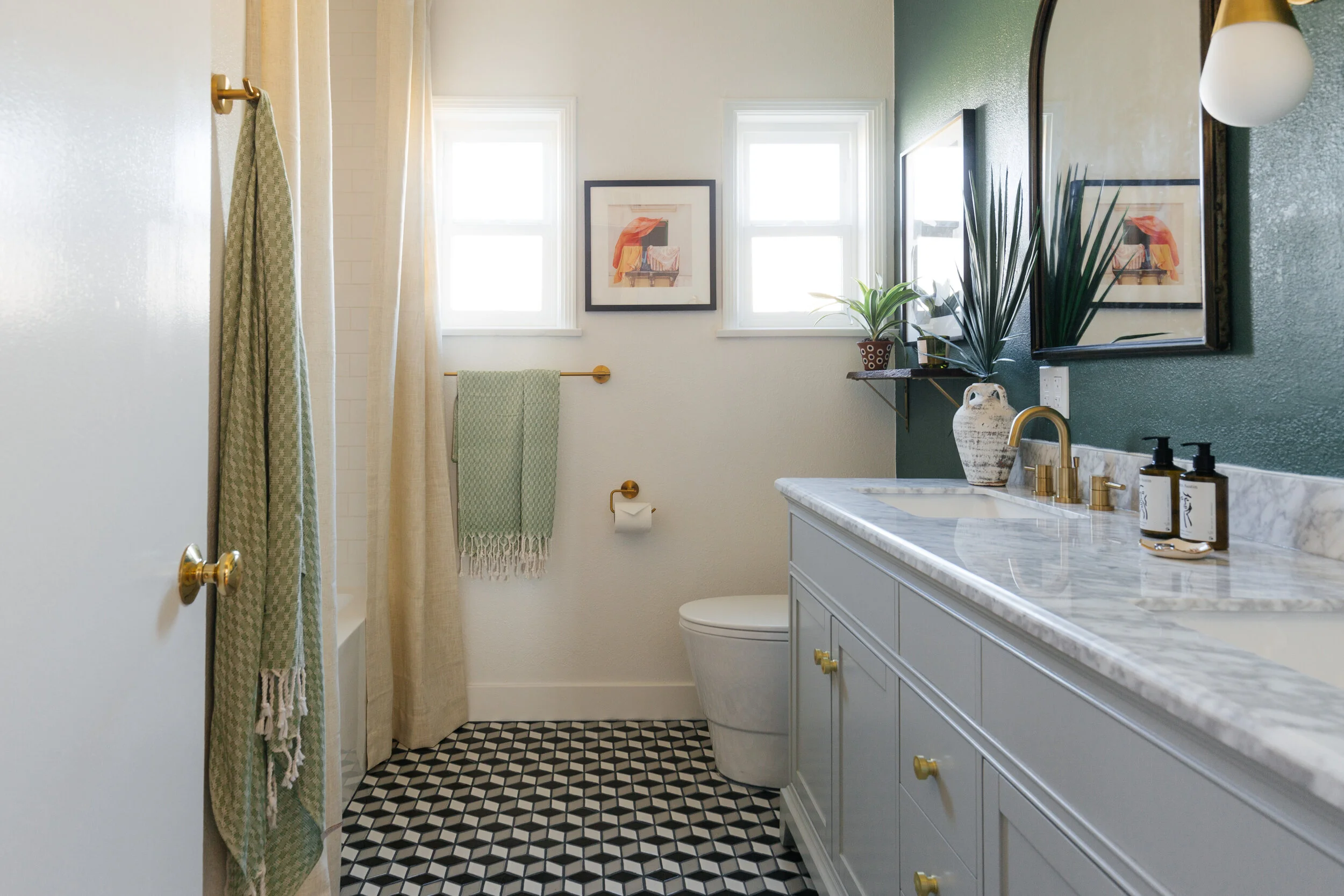
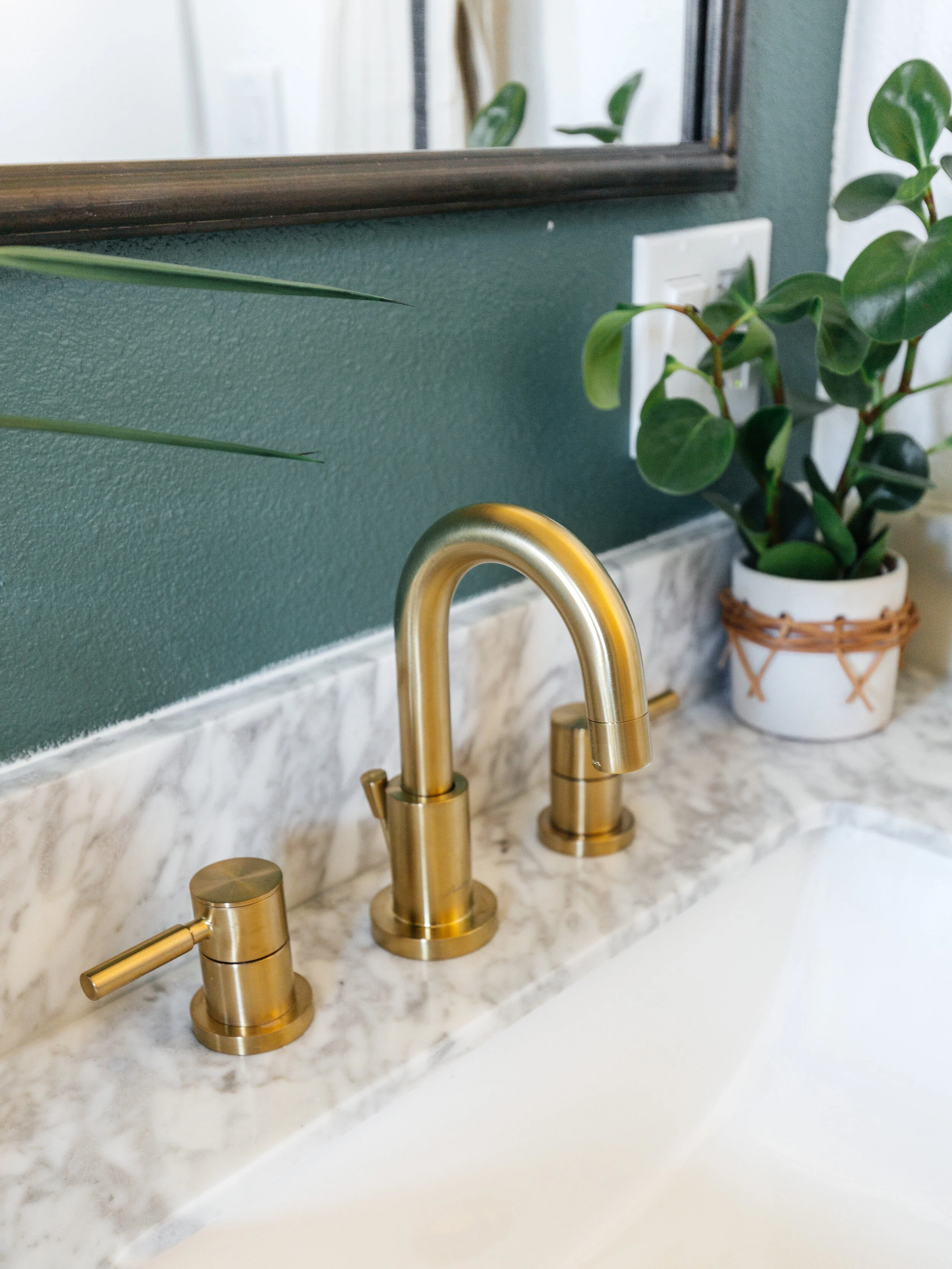
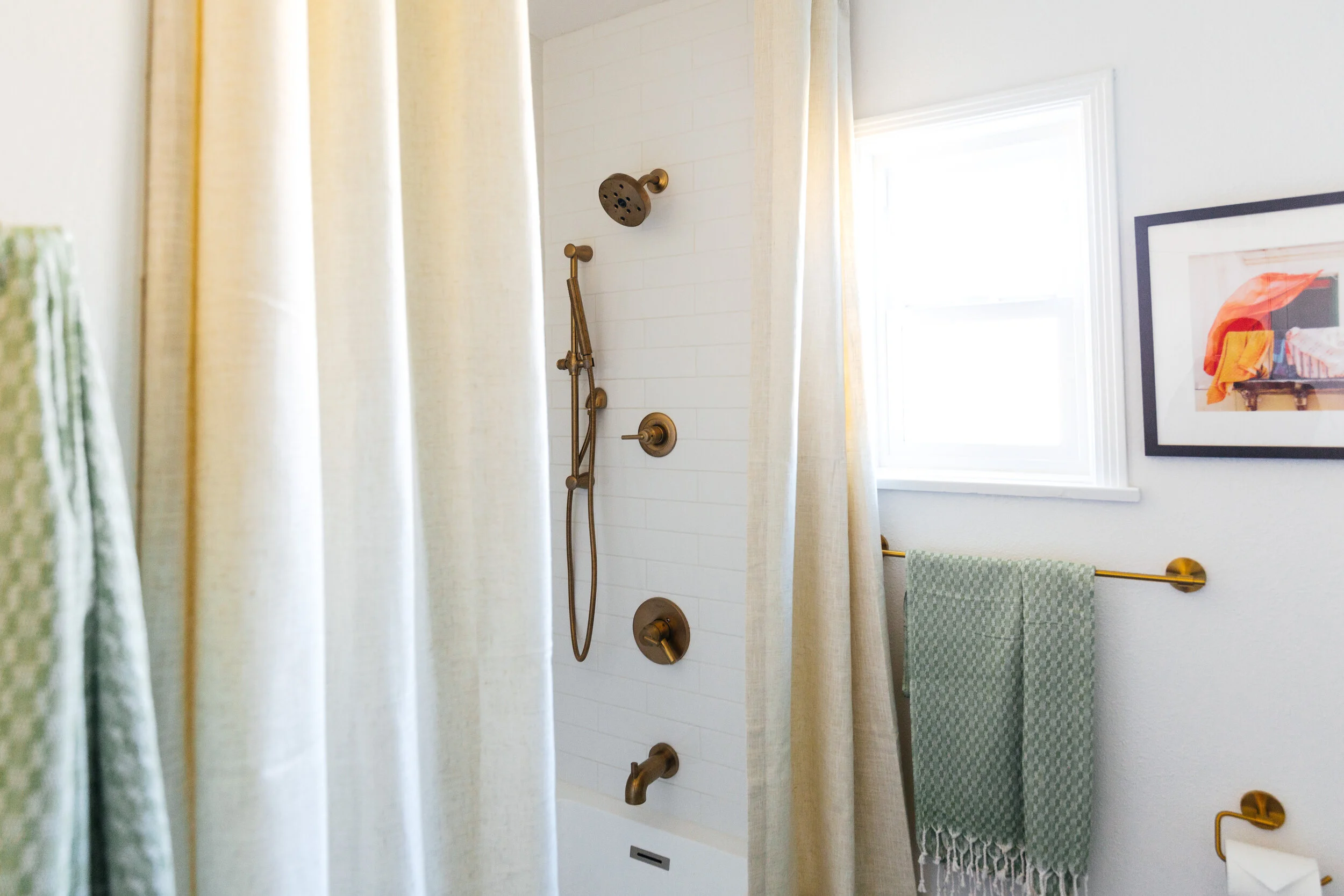
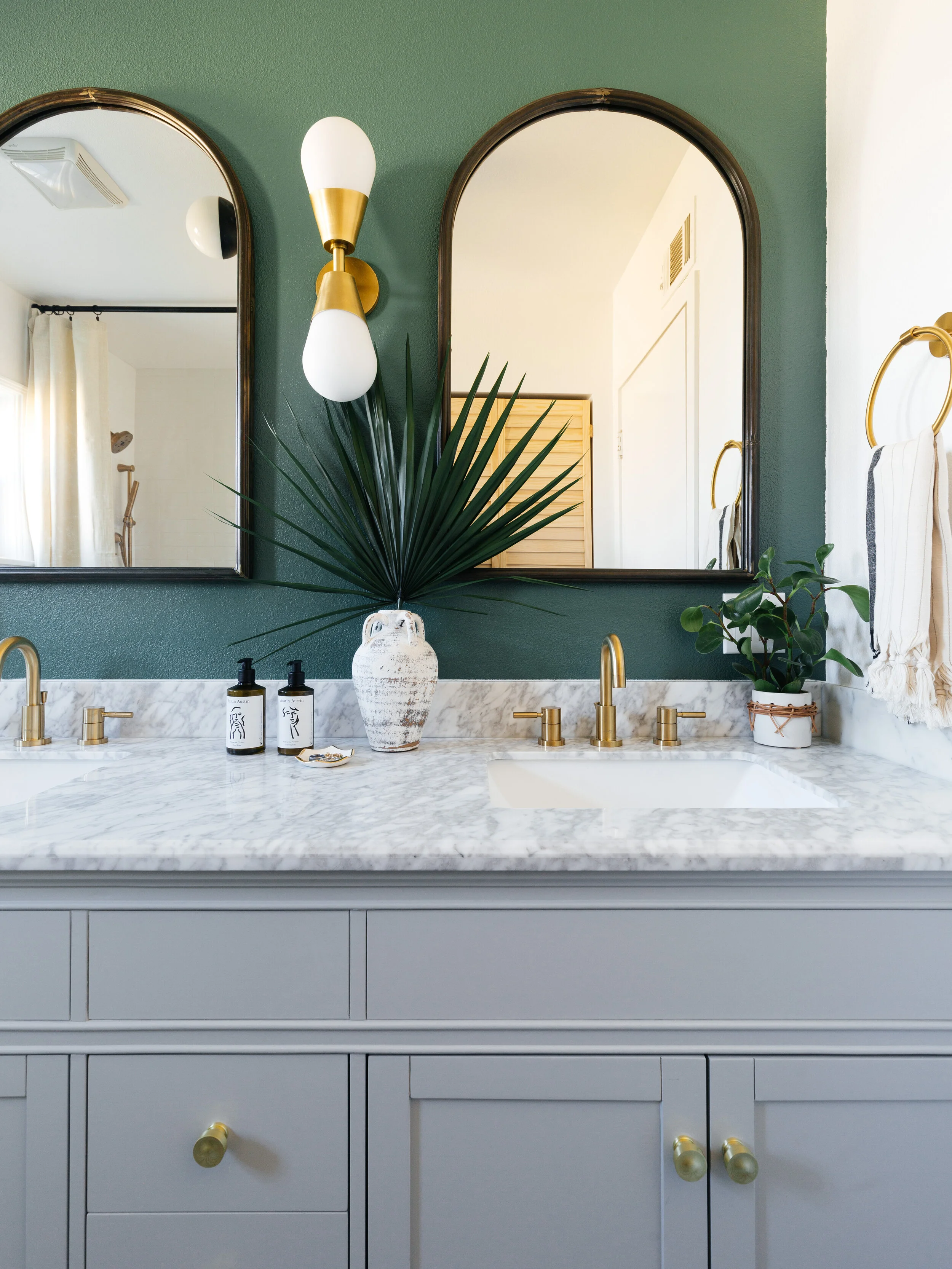
First we thought a lot about the flow and layout. The space is 96 inches x 104 inches. We moved the toilet away from the door and into the far back corner. We made sure we had a standard minimum of 30 inches for the toilet area. I think it ended being about 32 inches. The fabulous double vanity shifted over to the right wall. I love how veiny the carrara marble top is. We did swap out the cabinet pulls for gold ones. The tub stayed in the same location but now it’s more functional with a showerhead and handshower. Their old standing shower is gone and replaced with a new closet for lots of storage space. Everything just flows better now. It actually feels bigger and is way more functional.
After we nailed the layout, we thought about what kind of bold designs and details to add to the space. This room itself isn’t that interesting so by adding these prism mosaic tiles from Floor Decor, it makes the space visually more exciting. You can never go wrong with a tumbling tile pattern. I chose dove grey grout to make the pattern stand out even more. And then we painted the vanity wall a dark foresty green. We didn’t want the room to be too white but didn’t want it to feel too dark either so an accent wall is a great way to add visual interest without being overwhelming.
I chose to hang arched mirrors because they add an architectural element to the space. We hung the curtain rod all the way up to the ceiling to accentuate the height. I think it’s so odd that standard shower curtains are so short or why they’re never hung in pairs just like windows. By hanging linen curtains floor to ceiling just makes the shower feel more luxurious and romantic, doesn’t it?
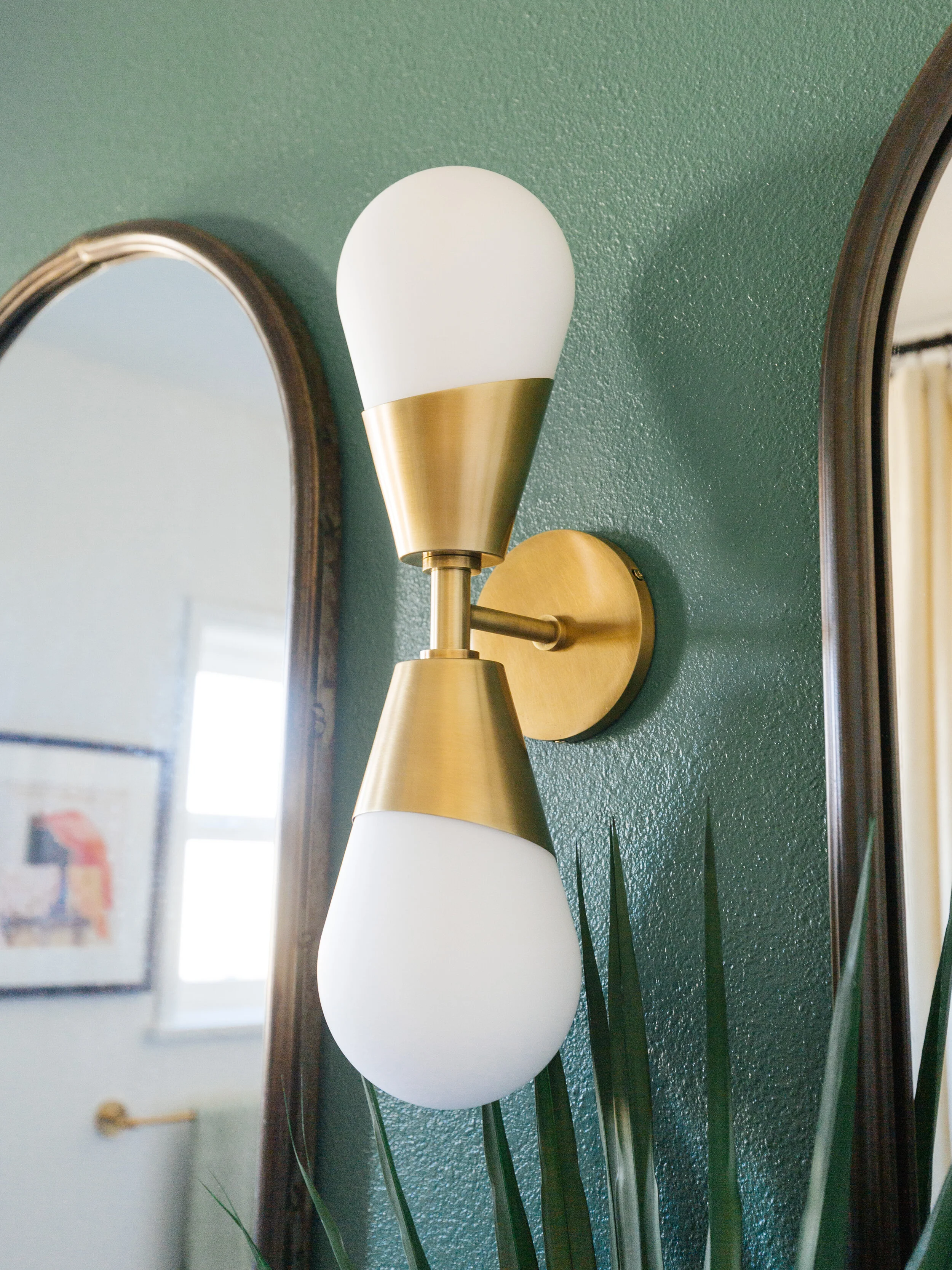
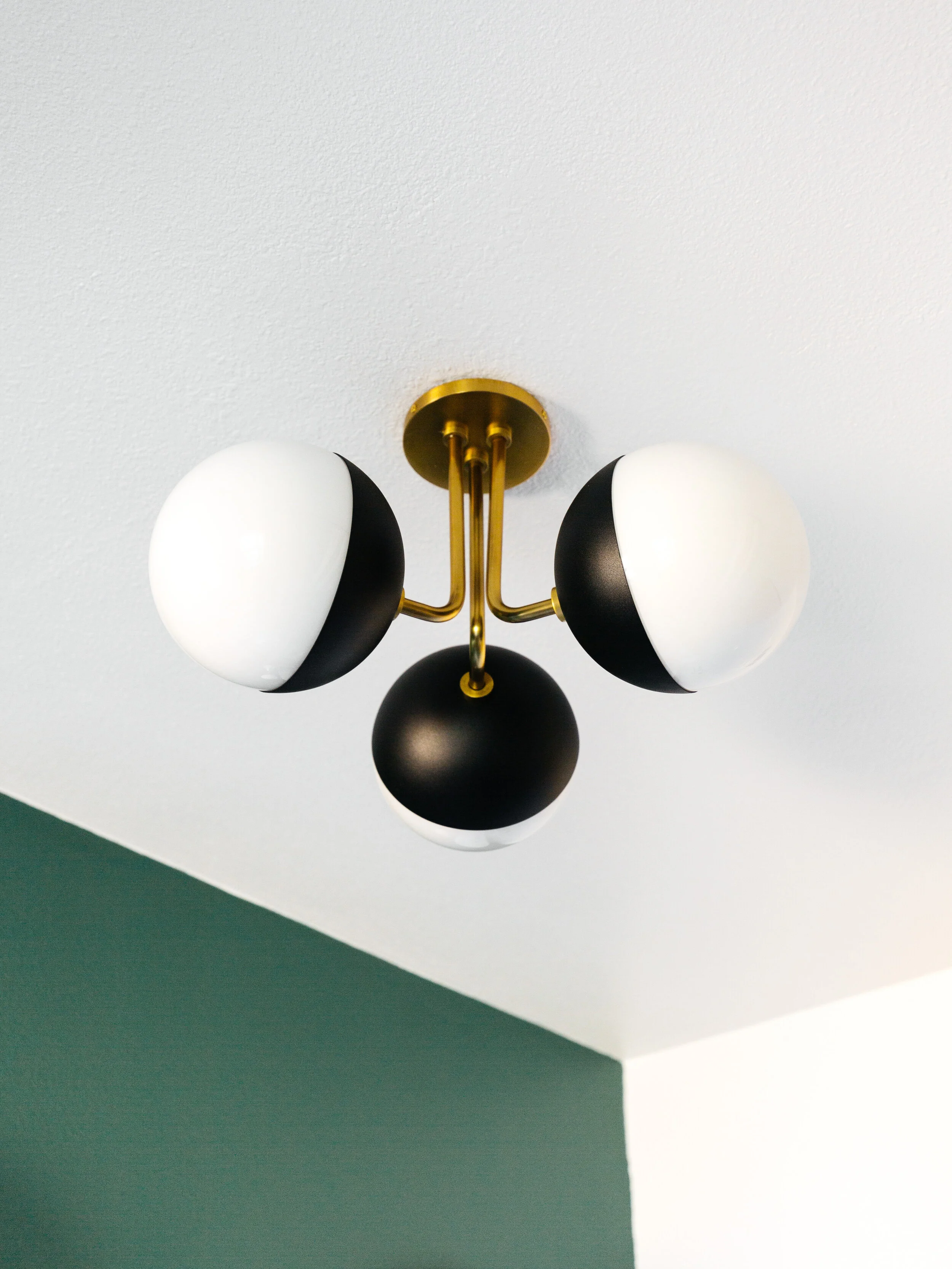
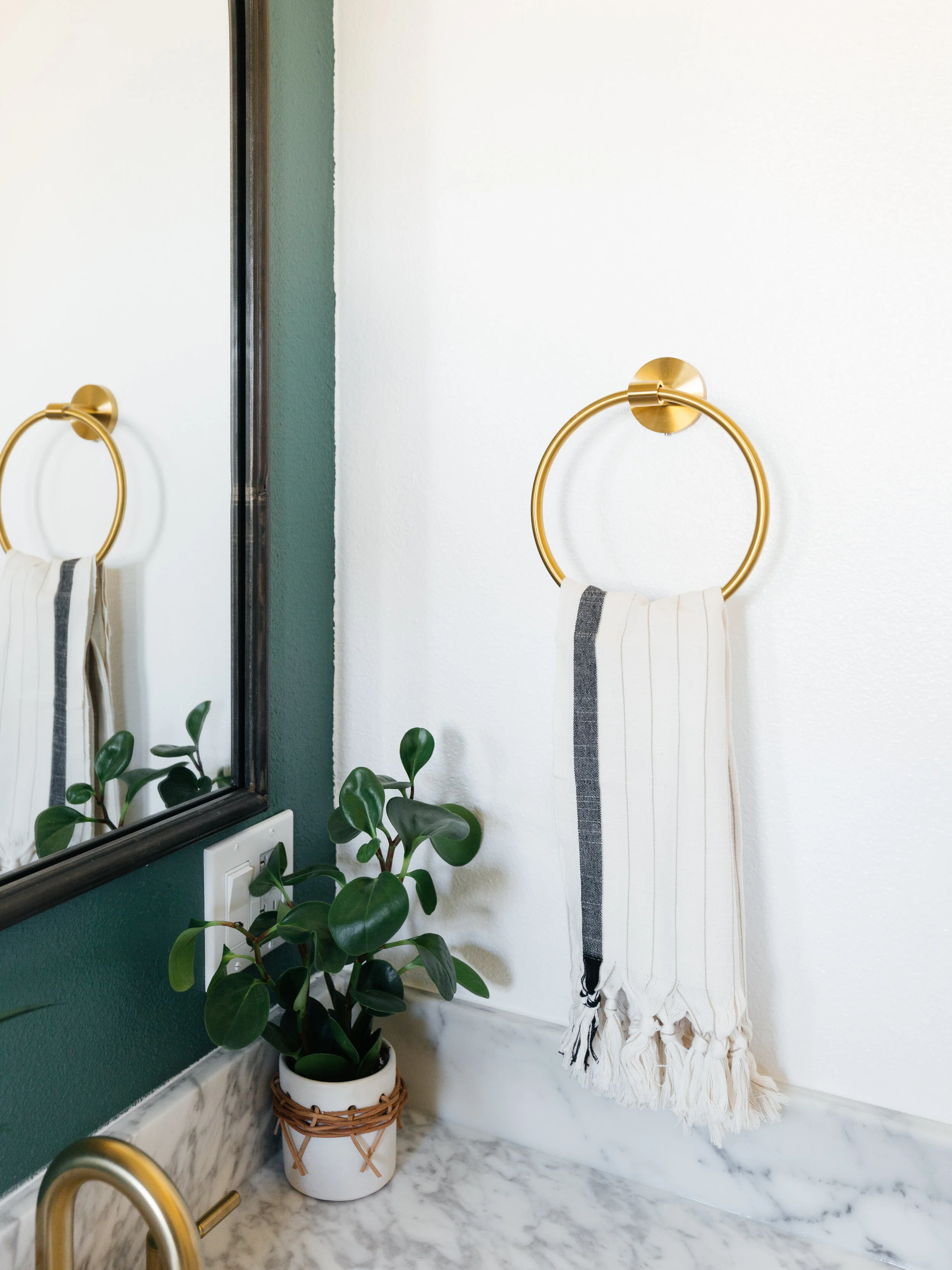
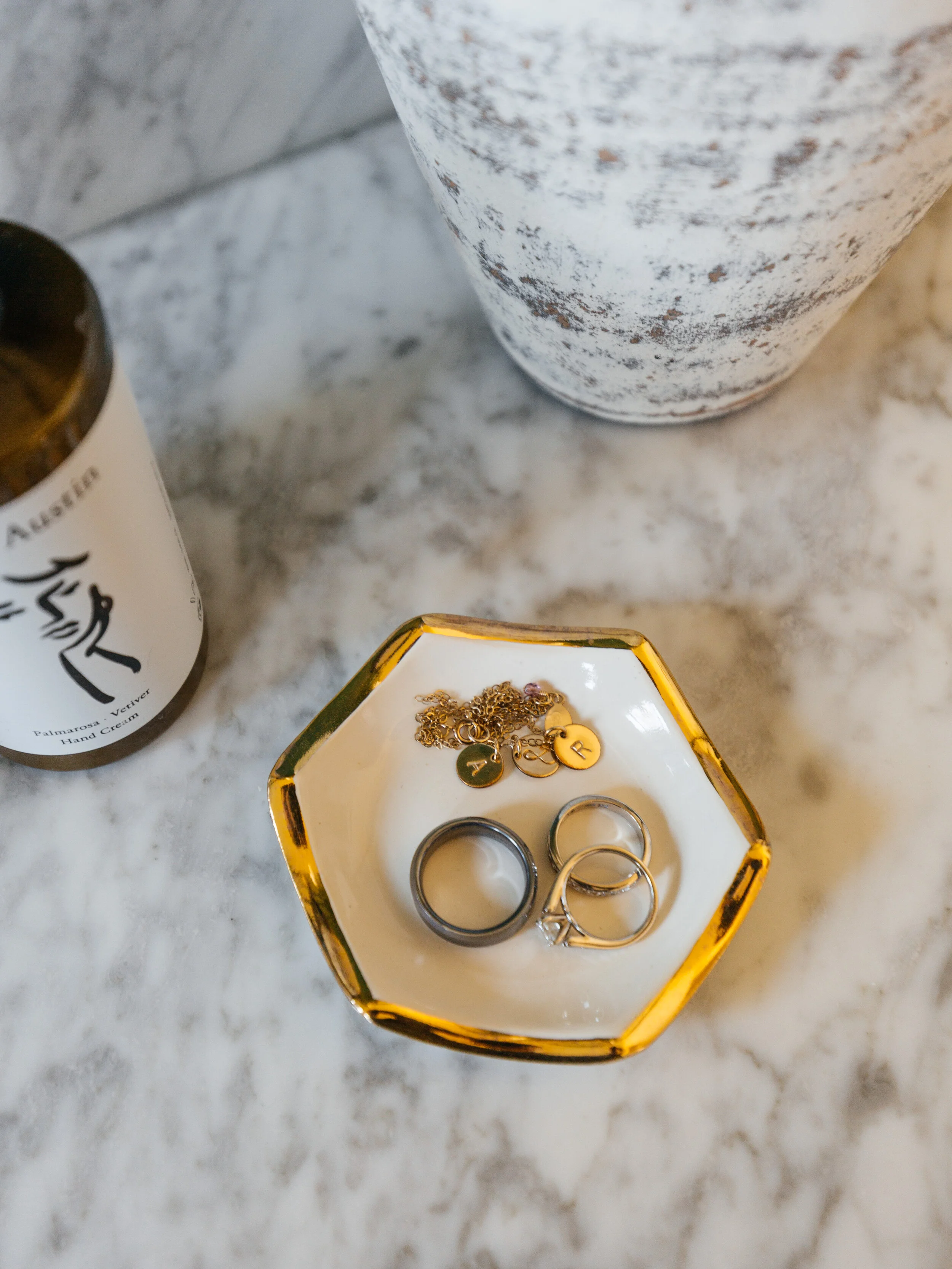
For the closet, we picked out shutter style doors. The wood adds a warm, natural element. For lighting we chose simple, modern pieces from Mitzi. The shower surround has classic subway tiles with white grout with a niche. Oh, we also added recessed lighting in there. For most of the fixtures we stuck with gold tones. I love the warmth it adds to a bathroom. The towel bar, toilet paper holder, hook, and towel ring are all from Floor & Decor.
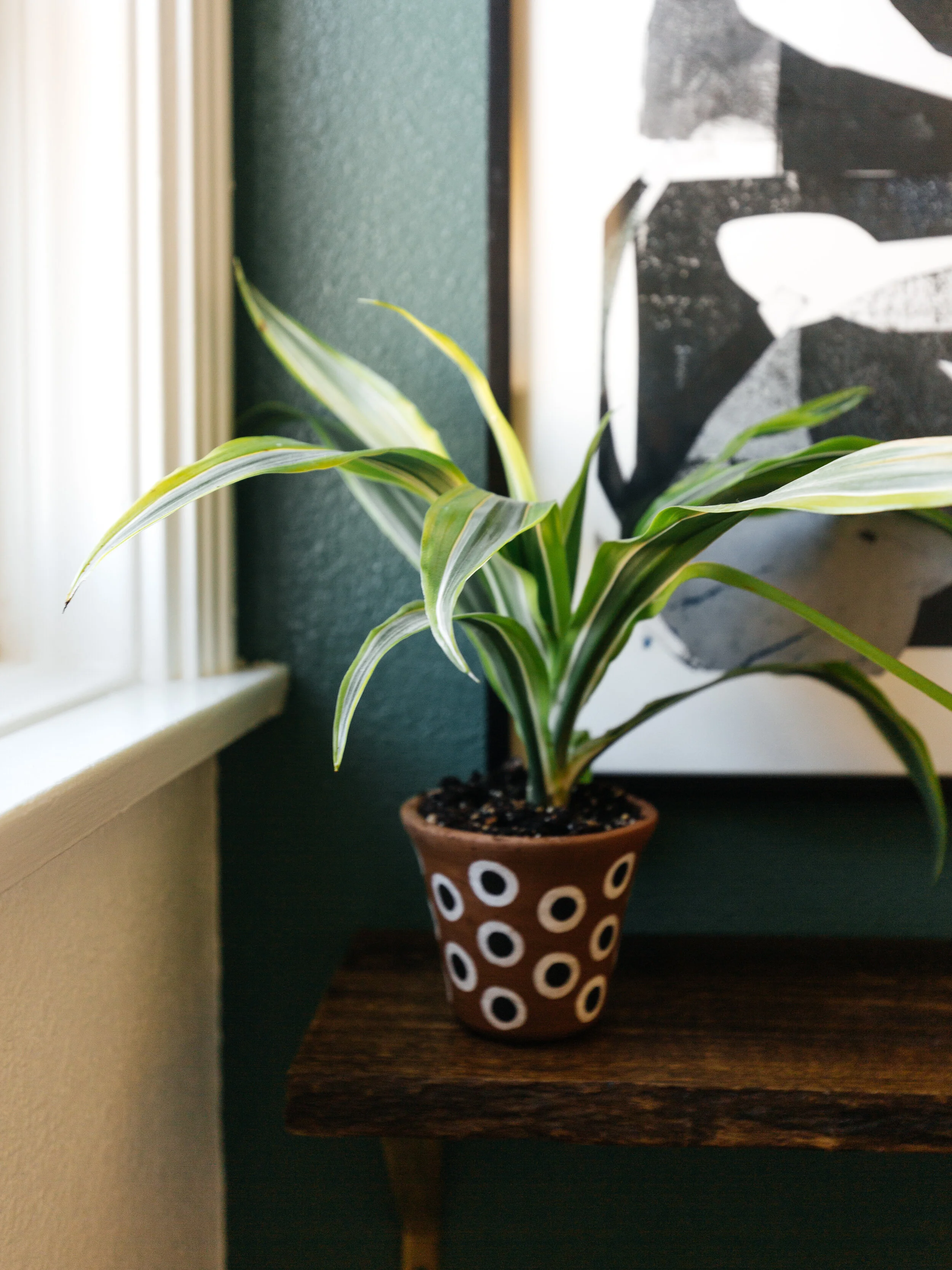
All these elements brought the space alive, along with some plants, and artworks. A big thanks to Floor & Decor for helping us out with this makeover. They are my go-to store for affordable tiles and flooring because they have so many different styles. They make it really easy to shop in store or online so head on over to a store near you for more inspiration. And there you have it! I hope this inspires you to makeover your bathroom in the coming year!
Get the look
Green Bath Towels
Hand Towel
Linen Curtains
Black Shower Rod
Shelf
Paint • BEHR Pine Brook

